---
package: "@svenskaspel/ui"
version: "4.4.0"
document_type: "component-documentation"
source: "@svenskaspel/ui/docs/bottom-sheet.md"
canonical_url: "/components/bottom-sheet"
usage_source: "src/app/(docs)/components/bottom-sheet/page.mdx"
---
# Bottom Sheet
The primary purpose of bottom sheets is to offer complementary content, and functionality, to what the webpage offers and support the service in offering a seamless, ergonomic, experience.
## Interactive demo
This demo lets you preview the bottom sheet component and its variations. Each button opens a different example.
[Interactive demo: Interactive demo](/components/bottom-sheet)
***
## Usage
### Types of bottom sheets
#### Non-modal
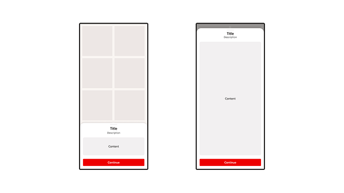
Non-modal bottom sheets co-exist with the screen’s main UI region and allow for simultaneously viewing and interacting with both regions, especially when the main UI region is frequently scrolled or panned.
Use a standard bottom sheet to display content that complements the screen’s primary content.
#### Modal
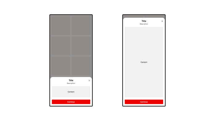
Like dialogs, modal bottom sheets appear in front of app content, disabling all other app functionality when they appear, and remaining on screen until confirmed, dismissed, or a required action has been taken.
### Create a clear hierarchy
Avoid stacking components on top of a bottom sheet that create a confusing hierarchy and an unclear way in how to interact with present components.
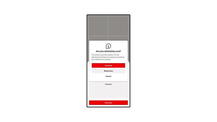
> **Don't:** Don’t show dialogs on top of bottom sheets.
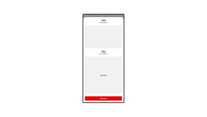
> **Don't:** Don’t stack bottom sheets on top of each other.
***
### Anatomy
Bottom sheets are anchored to the bottom of the viewport and are most often used on mobile interfaces.
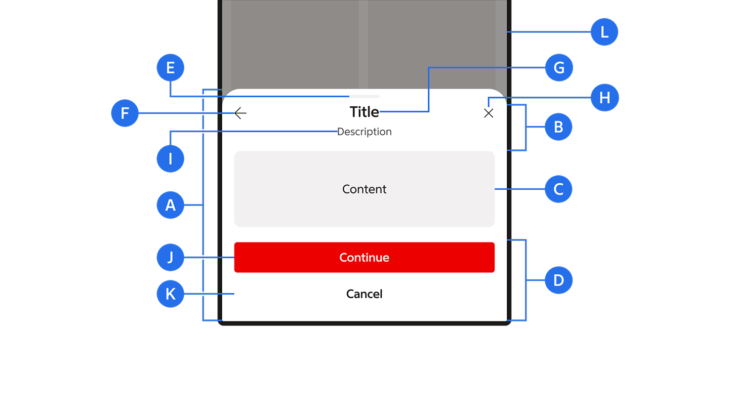
A. Container\
B. Header\
C. Content area\
D. Footer (optional)\
E. Drag handle\
F. Back action (optional)\
G. Title\
H. Close action (optional)\
I. Supportive text (optional)\
J. Primary action\
K. Dismissive action (optional)\
L. Scrim (modal only)
***
## Behaviour
### Height
Bottom sheets can be set to three different heights: Auto (default), Half and Full.
- **Auto (default)**\
The sheet grows to fit its content, capped at the viewport with a small safety margin from the top. If content exceeds the available space, the body becomes scrollable.
- **Half**\
The sheet is fixed at 50% of the viewport. Content that exceeds the available space becomes scrollable inside the body.
- **Full**\
The sheet takes up the viewport with a small safety margin\* from the top. Content that exceeds the available space becomes scrollable inside the body.
\* The safety margin is 24 px on small screens and 32 px on larger screens.
[Interactive demo: Height](/components/bottom-sheet)
### Content & scroll
Content that doesn’t fit within its container becomes scrollable inside the sheet. The header and footer stay fixed; the body scrolls when content overflows vertically.
[Interactive demo: Content & scroll](/components/bottom-sheet)
***
## Control
There are various ways of interacting with a bottom sheet depending on its variant.
### Fully expanded sheets
A fully expanded sheet can be dismissed in several ways:
- Swipe the sheet down to close it.
- If the content overflows, swipe inside the content area to scroll. Once you reach the top, continuing to swipe down closes the sheet.
- Click the close action in the top-right of the header.
- Click the scrim outside the sheet (modal only).
[Interactive demo: Fully expanded sheets](/components/bottom-sheet)
### Bottom sheets on desktop
Bottom sheets are primarily designed for mobile devices and tablets, but they can be used on desktop. The same component is used — mouse and trackpad replace touch gestures.
[Interactive demo: Bottom sheets on desktop](/components/bottom-sheet)
***
## Responsive layout
There are various ways of interacting with a bottom sheet depending on variant and state of the bottom sheet.
### Scaling and adaption
On mobile devices, bottom sheets extend across the width of a screen and are elevated above the primary content. Bottom sheets should scale to fit larger screens in one of three ways:
- Setting a maximum width of inner content.
- Switching to a floating sheet.
- Switching to a side sheet to reduce the amount of space occupied on larger screens.
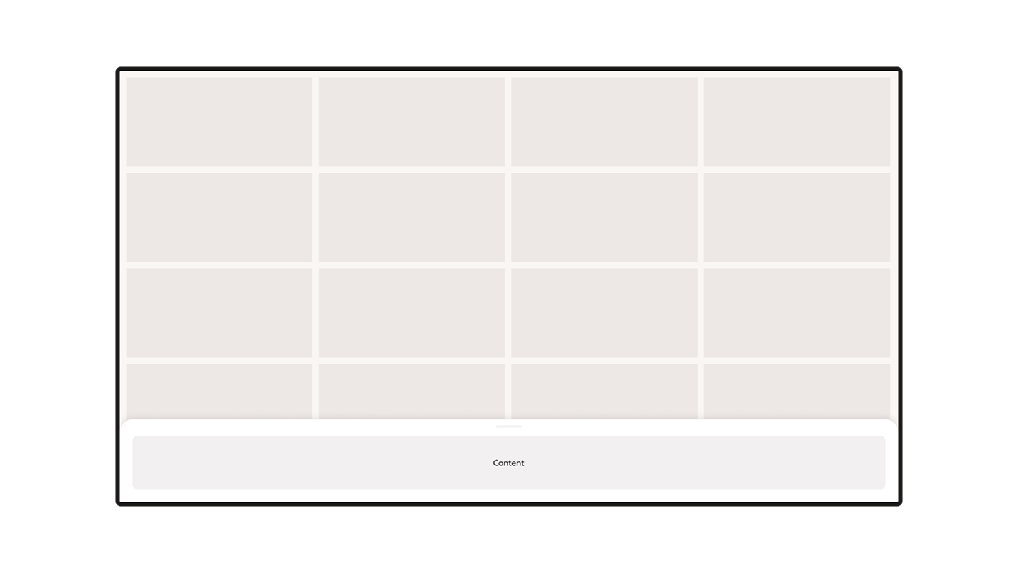
> **Don't:** Don’t set the inner content section to full width in large screen layouts.
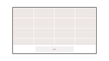
> **Do:** By setting a maximum width of the inner content of the sheet, the content can maintain a balance, and by this remain accessible.
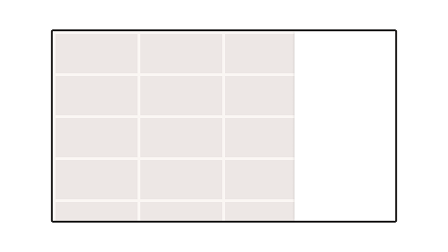
> **Do:** A bottom sheet can be swapped for a side sheet that shows supporting content on larger screens.
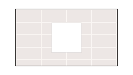
> **Do:** On large screens, to preserve the intent and the context of the primary content, supporting content can be placed within a floating sheet/overlay modal.
***
## Modify
### Content freedom
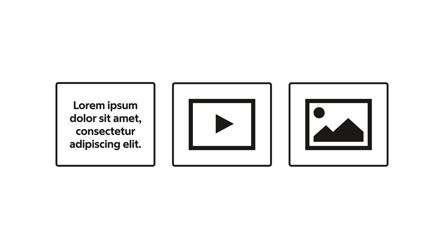
Sheets can contain different content and have different layouts. There are no specific rules to what you can, or can’t, place within a bottom sheet.
The bottom rule remains though: a bottom sheet, and its content, should be complementary to what the webpage’s main UI area offers.
---
# Readme / API
# `BottomSheet`
> **Deprecated:** Use [Drawer](https://github.com/SvenskaSpelAB/nova/blob/main/packages/ui/docs/drawer.md) for new development. Use the [nova-drawer-migration skill](https://github.com/SvenskaSpelAB/nova/blob/main/.agents/skills/nova-drawer-migration/SKILL.md) to migrate existing BottomSheets with help from your AI coding agent. Ask the agent: "Use $nova-drawer-migration to migrate this BottomSheet to Drawer." The existing API and Vaul implementation remain available; deprecation alone does not resolve focus conflicts with Base UI components.
The `BottomSheet` component provides a sliding panel that appears from the bottom of the screen. It's built using `vaul` (Drawer primitive) and provides a flexible way to display additional content or forms while maintaining context of the main interface.
## Importing
```typescript
import {
BottomSheet,
BottomSheetTrigger,
BottomSheetContent,
BottomSheetHeader,
BottomSheetTitle,
BottomSheetDescription,
BottomSheetBody,
BottomSheetFooter,
BottomSheetClose,
BottomSheetAction,
BottomSheetPortal,
BottomSheetOverlay,
} from '@svenskaspel/ui/react/bottom-sheet';
```
## Props
The `BottomSheet` component accepts all props that the underlying `DrawerPrimitive.Root` would accept, plus additional configuration options:
**`BottomSheet` Specific Props**
- `variant?: 'modal' | 'non-modal'` - Whether the sheet behaves as a modal (renders scrim, traps focus) or non-modal (no scrim, page remains interactive). Default: `'non-modal'`.
- `height?: 'auto' | 'half' | 'full'` - Sheet height behavior. `auto` hugs content (max-height capped at fully expanded), `half` is fixed at 50% of the viewport, `full` is fully expanded with safety margin from the top. Default: `'auto'`.
- `defaultOpen?: boolean` - Whether the drawer should be open by default
- `open?: boolean` - Controls the open state of the drawer (controlled component)
- `onOpenChange?: function` - Callback function called when the open state changes
- `container?: HTMLElement` - The container element to render the drawer in (default: document.body)
- `onAnimationEnd?: function` - Callback function called when animations end
- `dismissible?: boolean` - Whether the drawer can be dismissed by clicking outside or pressing escape (default: true)
- `handleOnly?: boolean` - Whether the drawer can only be dragged by its handle (default: false)
- `repositionInputs?: boolean` - Whether to reposition inputs when the drawer opens (default: true)
- `children: React.ReactNode` - The content of the bottom sheet
**`BottomSheetContent` Specific Props**
- `dragHandle?: boolean` - Whether the drag handle is rendered at the top of the sheet. Default: `true`. Set to `false` to hide the indicator. This does not disable dragging.
- `closeAction?: boolean` - Whether the close action (X icon, top-right) is rendered. Default: `true`.
- `backAction?: (event) => void` - When provided, renders a back action (left-pointing arrow) in the top-left of the sheet header and calls this function on click. If omitted, the back action is hidden. Use it to navigate between views inside the same sheet — the component does not manage navigation state, the consumer decides what "going back" means.
- `backActionLabel?: string` - Accessible label for the back action button (default: `"Tillbaka"`).
**Other Component Props**
Each sub-component accepts standard HTML props for their respective elements:
- `BottomSheetTrigger`: Extends `DrawerPrimitive.Trigger` props
- `BottomSheetContent`: Extends `DrawerPrimitive.Content` props with additional `className` support
- `BottomSheetHeader`, `BottomSheetBody`, `BottomSheetFooter`: Extend standard `div` props
- `BottomSheetTitle`: Extends `DrawerPrimitive.Title` props
- `BottomSheetDescription`: Extends `DrawerPrimitive.Description` props
## Usage
### Basic Bottom Sheet
```typescript
import * as React from 'react';
import {
BottomSheet,
BottomSheetTrigger,
BottomSheetContent,
BottomSheetHeader,
BottomSheetTitle,
BottomSheetDescription,
BottomSheetBody,
BottomSheetFooter,
BottomSheetClose,
} from '@svenskaspel/ui/react/bottom-sheet';
import { Button } from '@svenskaspel/ui/react/button';
const MyComponent = () => {
return (
Simple Bottom SheetThis is a simple Bottom Sheet example.
Here is some content inside the Bottom Sheet.
);
};
export default MyComponent;
```
### Modal Bottom Sheet with Full Height
```typescript
import * as React from 'react';
import { useState } from 'react';
import {
BottomSheet,
BottomSheetTrigger,
BottomSheetContent,
BottomSheetHeader,
BottomSheetTitle,
BottomSheetDescription,
BottomSheetBody,
BottomSheetFooter,
BottomSheetClose,
BottomSheetAction,
} from '@svenskaspel/ui/react/bottom-sheet';
import { Button, IconButton } from '@svenskaspel/ui/react/button';
import Minus from '@svenskaspel/ui/react/icons/Minus';
import Plus from '@svenskaspel/ui/react/icons/Plus';
const AdvancedComponent = () => {
const [goal, setGoal] = useState(350);
const onClick = (adjustment: number) => {
setGoal(Math.max(200, Math.min(400, goal + adjustment)));
};
return (
Move GoalSet your daily activity goal. onClick(-10)} disabled={goal <= 200}>
{goal}
Calories/day
onClick(10)} disabled={goal >= 400}>
);
};
export default AdvancedComponent;
```
:::info
When using `variant="modal"`, the bottom sheet displays a backdrop overlay (scrim) and traps focus. With `variant="non-modal"` (the default), the page beneath remains interactive and no scrim is rendered. The `closeAction` prop (default `true`) controls whether the X icon in the top-right is shown — turn it off via `closeAction={false}` if a sheet should only be dismissed via the footer.
The `height` prop controls the sheet's height behavior: `auto` (default) hugs the content with a capped max-height, `half` keeps it at 50% of the viewport, and `full` takes up the full viewport with a small safety margin.
:::
### Bottom Sheet with Back Action
Pass a `backAction` callback to `BottomSheetContent` to show a back arrow in the top-left of the header. Use it to navigate between views inside the same sheet — for example, drilling into a sub-screen and returning. When `backAction` is `undefined`, the arrow is hidden. The component renders the button only; the consumer is responsible for updating the visible content when the callback fires.
```typescript
import * as React from 'react';
import {
BottomSheet,
BottomSheetTrigger,
BottomSheetContent,
BottomSheetHeader,
BottomSheetTitle,
BottomSheetDescription,
BottomSheetBody,
} from '@svenskaspel/ui/react/bottom-sheet';
import { Button } from '@svenskaspel/ui/react/button';
const SettingsSheet = () => {
const [view, setView] = React.useState<'list' | 'limits'>('list');
return (
!open && setView('list')}>
setView('list') : undefined}>
{view === 'list' && (
<>
SettingsManage your account
)}
{view === 'limits' && (
<>
Spending limitsAdjust your limits{/* limits UI */}
)}
);
};
```
## API
### `BottomSheet`
The root component that manages the bottom sheet state and provides context to child components.
**Example**:
```js
{/* BottomSheet content */}
```
**Options**:
| Option | Type | Default | Description |
| ---------------- | ---------------------------- | ------------- | ----------------------------------------------------------------------------------------------------------------------------------------------------------------------------------- |
| variant | `'modal' \| 'non-modal'` | `'non-modal'` | Whether the sheet behaves as a modal (renders scrim, traps focus) or non-modal (no scrim, page remains interactive). |
| height | `'auto' \| 'half' \| 'full'` | `'auto'` | Sheet height behavior. `auto` hugs content (max-height capped at fully expanded). `half` is fixed at 50% of the viewport. `full` is fully expanded with safety margin from the top. |
| defaultOpen | boolean | - | Whether the drawer should be open by default |
| open | boolean | - | Controls the open state of the drawer (controlled component) |
| onOpenChange | function | - | Callback function called when the open state changes |
| container | HTMLElement | document.body | The container element to render the drawer in |
| onAnimationEnd | function | - | Callback function called when animations end |
| dismissible | boolean | true | Whether the drawer can be dismissed by clicking outside/escape |
| handleOnly | boolean | false | Whether the drawer can only be dragged by its handle |
| repositionInputs | boolean | true | Whether to reposition inputs when the drawer opens |
**Returns**:
```
React component with drawer functionality
```
---
### `BottomSheetTrigger`
A button or element that triggers the bottom sheet to open. Usually used with `asChild` prop.
**Example**:
```js
```
---
### `BottomSheetContent`
The main container for the bottom sheet content. Automatically includes portal rendering and overlay when used.
**Example**:
```js
{/* Other content */}
```
**Options**:
| Option | Type | Default | Description |
| --------------- | ------------------------------------------------------ | ------------ | ----------------------------------------------------------------------------------------------------------------------------------------------------------- |
| dragHandle | `boolean` | `true` | Whether the drag handle is rendered at the top of the sheet. Set to `false` to hide the indicator; dragging is still enabled. |
| closeAction | `boolean` | `true` | Whether the close action (X icon) is rendered in the top-right. Set to `false` if the sheet should only be dismissed via the footer or by clicking outside. |
| backAction | `(event: React.MouseEvent) => void` | - | When provided, renders a back action (left-pointing arrow) in the top-left of the header and calls this function on click. |
| backActionLabel | `string` | `"Tillbaka"` | Accessible label (`aria-label`) for the back action button. |
| className | `string` | - | Additional CSS classes for the content container. |
| ...props | `React.ComponentProps<'div'>` | - | Any other props are forwarded to the underlying content `
`. |
---
### Drag indicator
`BottomSheetContent` renders the indicator internally when `dragHandle` is `true`. There is no public `BottomSheetHandle` export. Hiding the indicator does not disable Vaul's drag or dismiss behavior; use the root's `dismissible` and `handleOnly` options for gesture behavior.
---
### `BottomSheetHeader`
Container for the title and description of the bottom sheet.
**Example**:
```js
TitleDescription text
```
---
### `BottomSheetBody`
The main content area of the bottom sheet.
**Example**:
```js
Your content here
```
---
### `BottomSheetFooter`
Container for action buttons at the bottom of the sheet.
**Example**:
```js
```
---
### `BottomSheetAction`
Wrapper for primary action buttons in the footer, with appropriate spacing and alignment.
---
### `BottomSheetClose`
A component that closes the bottom sheet when clicked. Usually used with `asChild` prop.
**Example**:
```js
```
---
## Additional Information
- Built on top of [Vaul](https://vaul.emilkowal.ski/) drawer primitive
- Supports touch gestures for mobile interactions
- Automatically handles accessibility attributes
- Responsive design with different behaviors on mobile vs desktop
- Integrates with the SVS design system color tokens
---