---
package: "@svenskaspel/ui"
version: "4.4.0"
document_type: "component-documentation"
source: "@svenskaspel/ui/docs/carousel.md"
canonical_url: "/components/carousel"
usage_source: "src/app/(docs)/components/carousel/page.mdx"
---
# Carousel
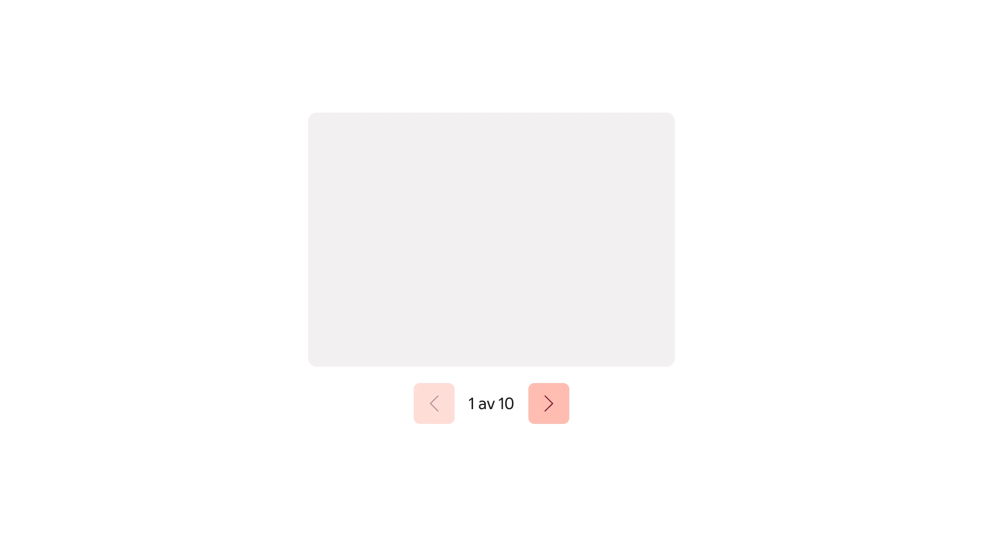
Carousel allows the user to navigate back and forwards horizontally through a set of thematically similar items.
***
## Usage
Use a Carousel to let users browse a sequence of related images or other content within a shared space. It works best when users can explore items individually without needing to compare them side by side. Keep each slide focused and use a consistent layout.
### Content
Carousels are suitable for presenting images and texts that users can explore one at a time. Each slide should be concise, self-contained and consistent in structure. Avoid content that relies on reading slides in order, or information that users need to compare side by side. Essential information should be kept outside of the Carousel.
The recommended amount of slides within a carousel is three to five. More or fewer can be appropriate, but consider if another interaction pattern may be more suitable.
### Suitable use cases
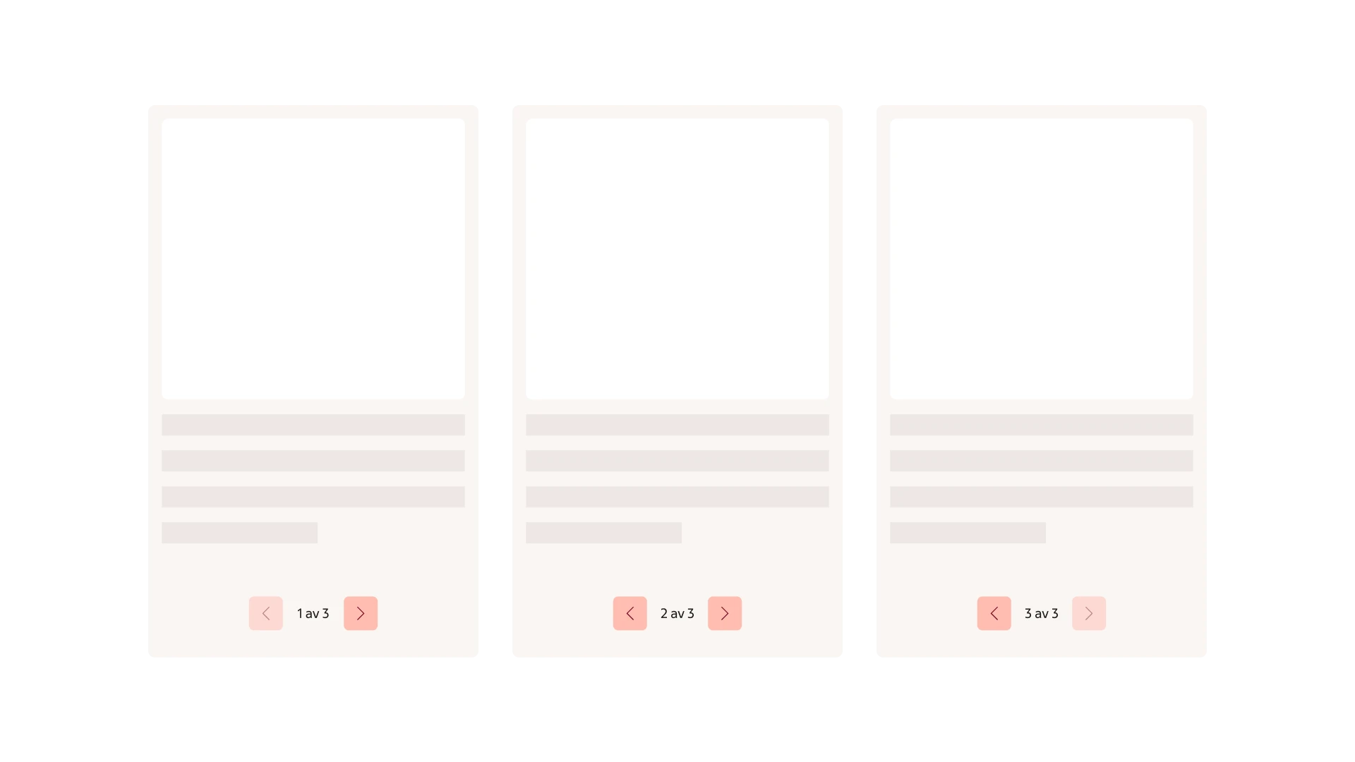
> **Do:** Use a carousel for content users can explore one item at a time.
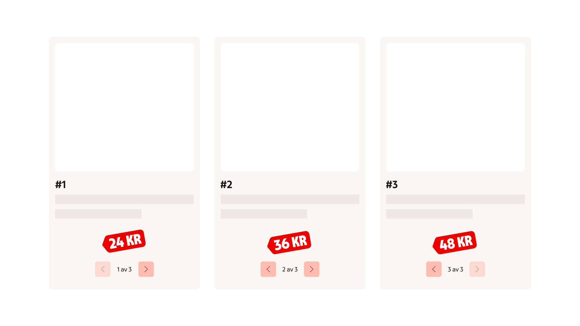
> **Don't:** Don’t use it for essential information or content users need to compare side by side.
### Consistent content
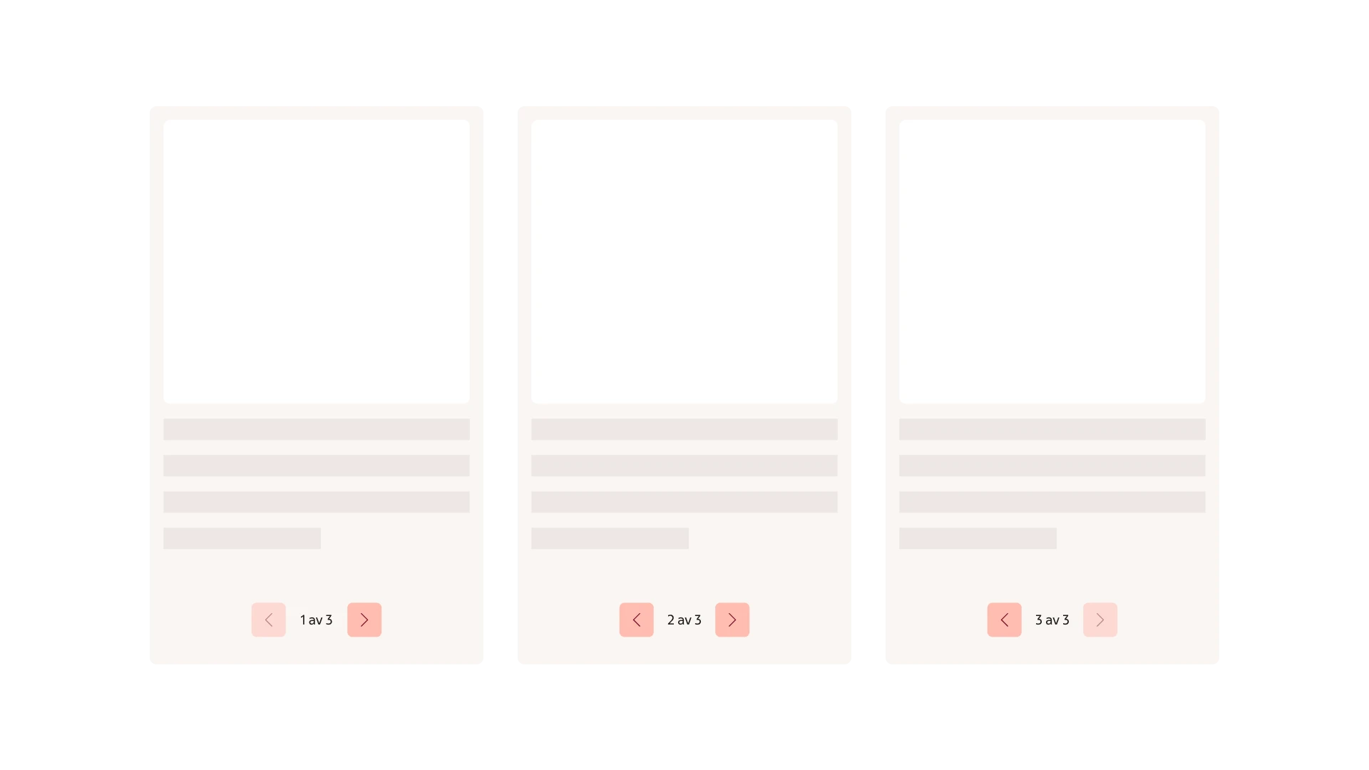
> **Do:** Group related content and use a consistent layout across slides.
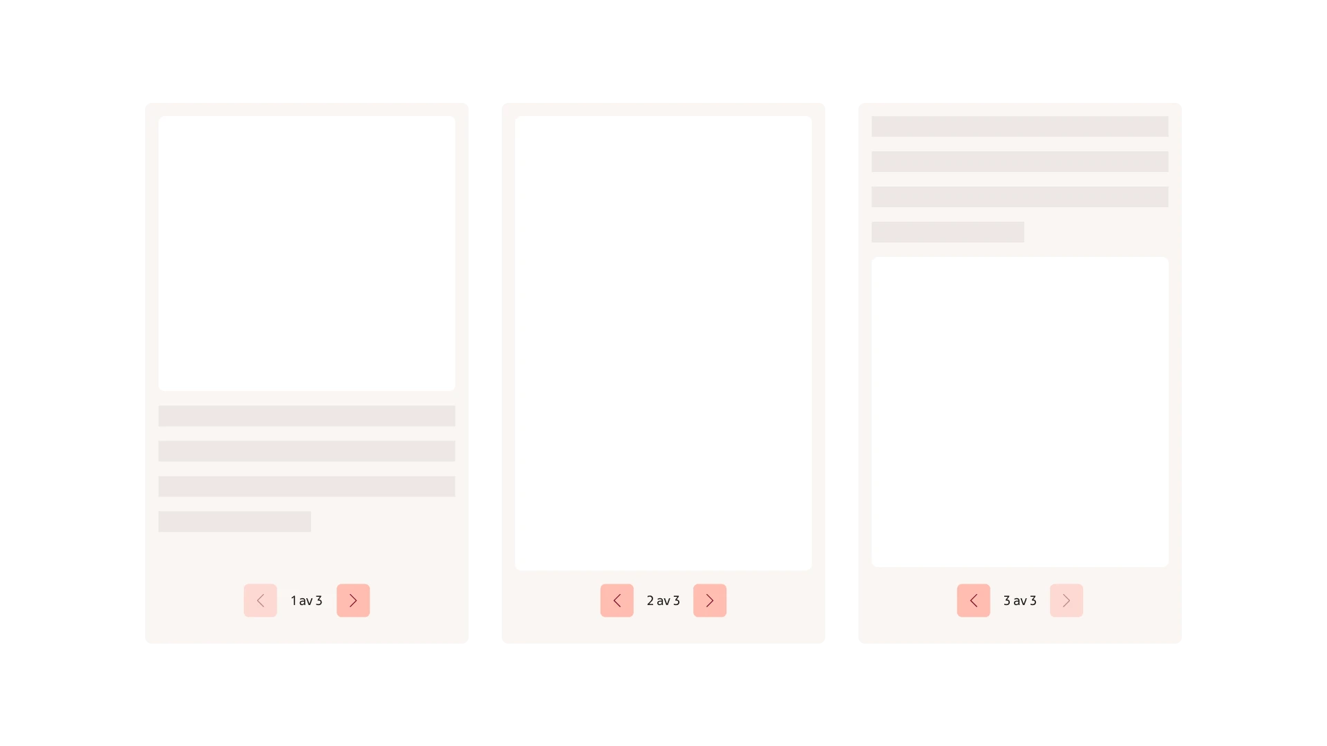
> **Don't:** Don’t mix unrelated content or change the layout unexpectedly between slides.
***
## Formatting
### Anatomy
Carousel is made up of an area for adding content along with an instance of the pagination providing controls for navigating back and forward.
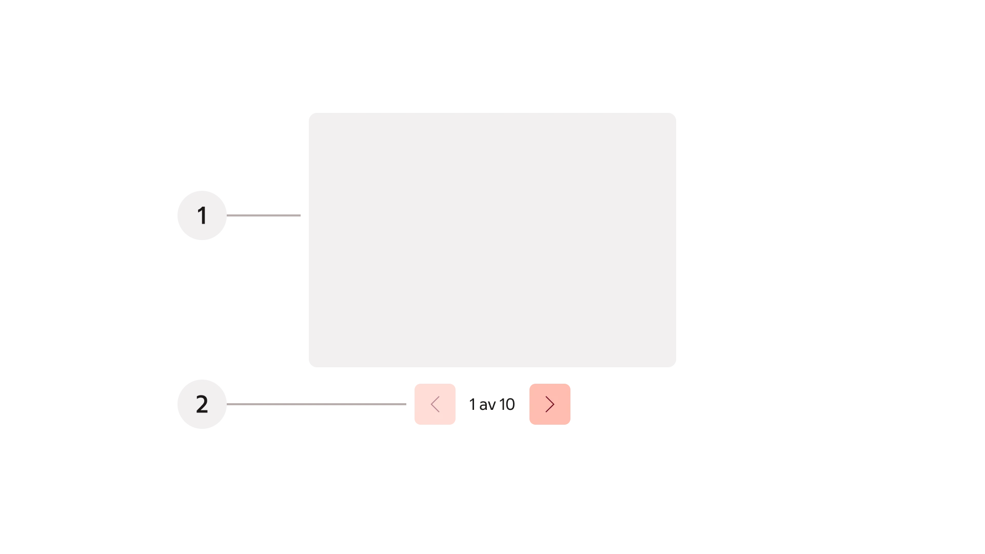
1. Content area
2. Pagination
***
## Behaviour
### Navigation
Previous and next controls are provided through the pagination component. Let the user manually control navigation, automatic advancement is not supported. A counter with current position along with total number of slides is displayed. Relevant controls are displayed at the start and the end of the sequence. Typically navigation should not loop last frame back to first, and vice versa.
Left and right arrow keys navigate horizontally with a keyboard. In touch devices swiping is supported to navigate.
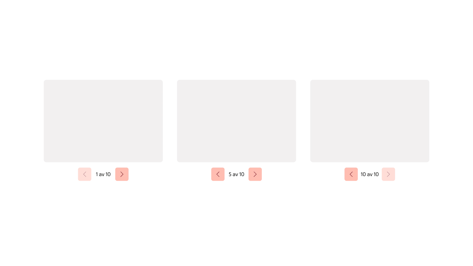
Pagination used for navigating the content of the Carousel.
---
# Readme / API
# `Carousel`
Carousel displays content that users can navigate with swipes, dragging, buttons, and arrow keys. Embla remains the carousel engine. The simple variant displays one slide at a time with Pagination Simple below the content.
## Import and usage
```tsx
import { Carousel, CarouselContent, CarouselItem, CarouselPagination } from '@svenskaspel/ui/react/carousel';
First offer
Second offer
Third offer
;
```
The consumer controls the slide content and its height. Carousel does not enable automatic playback.
## Anatomy
- `Carousel` creates the Embla instance and shares navigation state with its parts.
- `CarouselContent` creates a clipped viewport and a flex container for the slides.
- `CarouselItem` represents a slide. Place content inside this part to preserve the spacing between slides.
- `CarouselPagination` reuses `PaginationSimple`, with previous and next buttons and `PaginationStatus`.
- `CarouselPrevious` and `CarouselNext` remain available as optional controls beside the content.
All parts must be inside `Carousel`. Carousel uses Base UI `useRender` for composition and Embla for scrolling.
## Props
### `Carousel`
| Prop | Type | Default | Description |
| -------------------------------- | -------------------------------- | -------------- | ----------------------------------------------------------------------------------- |
| `opts` | Embla options | Embla defaults | Options such as `loop`, `align`, `startIndex`, `slidesToScroll`, and `direction`. |
| `plugins` | Embla plugins | — | Preserves support for Embla plugins. |
| `orientation` | `horizontal` or `vertical` | `horizontal` | Controls layout, the Embla axis, and arrow keys. Takes precedence over `opts.axis`. |
| `setApi` | `(api: CarouselApi) => void` | — | Provides access to the Embla instance. |
| `render` | React element or render function | `div` | Composition through Base UI. |
| `aria-label` / `aria-labelledby` | HTML attributes | — | Provide an accessible name describing the carousel's content. |
Other div attributes and a ref are supported. The region defaults to `tabIndex={0}`. `CarouselApi` and `CarouselProps` are exported for TypeScript consumers.
### `CarouselContent` and `CarouselItem`
Both support div attributes, a ref, `className`, and Base UI `render`. `CarouselItem` has the `group` role and the role description "slide". Provide a descriptive name, preferably including the slide's position, through `aria-label` or `aria-labelledby`.
### `CarouselPagination`
| Prop | Type | Default | Description |
| ----------- | ------------------------------------------------- | --------- | ----------------------------------------- |
| `emphasis` | `low` or `high` | `high` | The visual emphasis of Pagination Simple. |
| `format` | `(page: number, totalPages: number) => ReactNode` | "1 av 10" | Customizes the page status text. |
| `className` | `string` | — | Extends the navigation layout. |
Nav attributes and a ref are supported. The accessible name is "Sidnavigering" and can be overridden with `aria-label`. This part has fixed content and does not expose `children` or `render`.
The status is calculated from Embla's scroll snaps, including when multiple slides scroll together. It updates after button clicks, swipes, dragging, API calls, resizing, and content changes. Both buttons are disabled when there is only one page. An empty carousel displays "0 av 0". When `loop` is enabled, button availability follows Embla's scrolling state.
### `CarouselPrevious` and `CarouselNext`
Support the same props and `render` as `Button`. Defaults are `variant="outline"` and `size="sm"`, with a 32 px icon button. Accessible names are "Föregående bild" and "Nästa bild". The controls use `type="button"` and are disabled at the carousel's boundaries. Consumer event handlers are merged with the navigation behavior.
## Variants and sizing
`CarouselPagination` supports `high` (default) and `low` emphasis. The consumer controls the carousel width and slide height. Pagination uses 40 px buttons, a 16 px gap above, and 16 px padding below.
To display multiple slides in the viewport, use a class such as `className="basis-1/2"` on `CarouselItem`. The default spacing is 16 px. Change both the `CarouselContent` margin and `CarouselItem` padding when adjusting that spacing.
Vertical carousels require a constrained height on `CarouselContent`, such as `className="h-120"`.
## Accessibility and keyboard navigation
- Give the carousel and its slides accessible names.
- Tab moves focus to the region, its interactive content, and its controls.
- Left and right arrow keys navigate horizontally; up and down arrow keys navigate vertically.
- For right-to-left content, use both `dir="rtl"` and `opts={{ direction: 'rtl' }}`.
- Arrow keys inside text inputs, editable content, and fields with their own arrow-key behavior do not navigate the carousel. Modified or already handled key events are ignored. Navigation runs in the bubble phase so child controls can prevent the default action or stop propagation when they own the key interaction.
- Controls have accessible names, and disabled controls cannot be activated.
- The page status is announced through `aria-live="polite"`.
## `render` composition
```tsx
}>
}>
Article content
```
Base UI merges attributes, classes, refs, and event handlers with the element supplied through `render`. Custom components must spread the received props and forward the ref. Render functions must spread the props supplied by Base UI onto their element.
## Embla API
```tsx
import * as React from 'react';
import {
Carousel,
type CarouselApi,
CarouselContent,
CarouselItem,
CarouselPagination,
} from '@svenskaspel/ui/react/carousel';
const [api, setApi] = React.useState();
{/* One CarouselItem per slide */}
;
```
The `api` provides methods including `scrollTo`, `scrollPrev`, `scrollNext`, and `selectedScrollSnap`, as well as Embla events. Existing `opts`, `plugins`, `orientation`, `setApi`, and component exports remain available for CMS and other consumers.