---
package: "@svenskaspel/ui"
version: "4.4.0"
document_type: "component-documentation"
source: "@svenskaspel/ui/docs/composable-modal.md"
canonical_url: "/components/composable-modal"
usage_source: "src/app/(docs)/components/composable-modal/page.mdx"
---
# Composable Modal
Composable Modal is a modal container that allows flexible content layouts. It uses the same modal behaviour and accessibility as Dialog, but does not enforce the standard header/content/footer structure.

***
## Usage
Use Composable Modal for focused tasks that need a custom layout inside a modal. For confirmations, simple forms, and standard “Save/Cancel” flows, use Dialog. Use Snackbar for minor notifications.
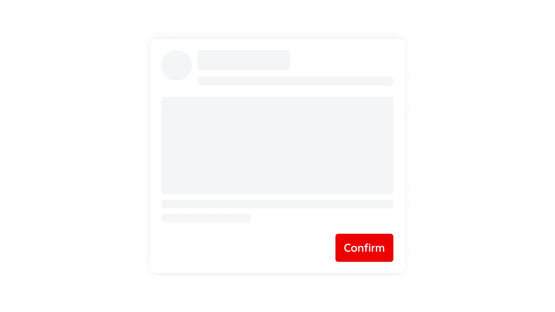
> **Don't:** Don’t hide a clear way to cancel or close the modal.
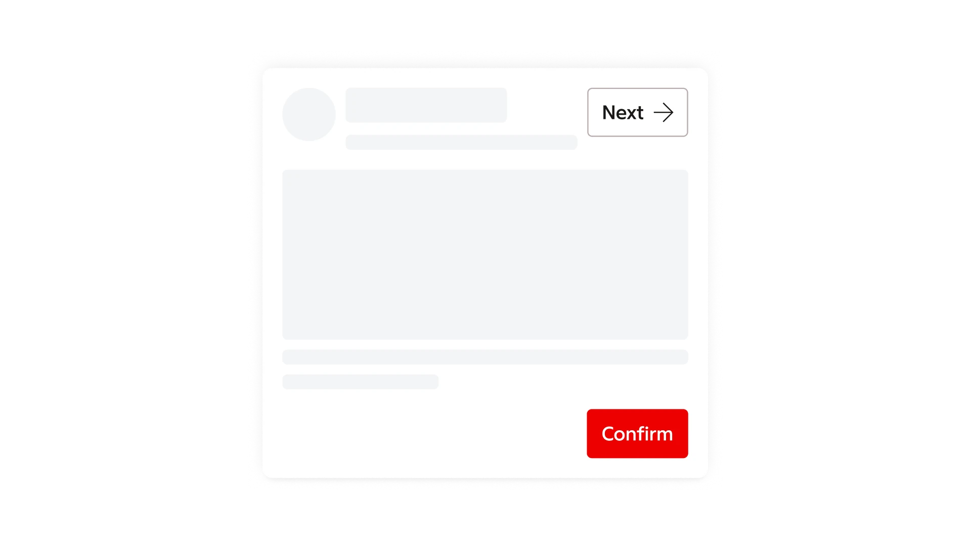
> **Don't:** Don’t create multiple competing confirming actions.
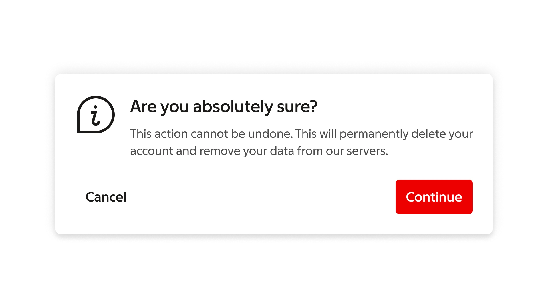
> **Do:** For simple confirmation messaging use the Dialog component.
***
## Formatting
### Anatomy
Composable Modal provides a container and a content area. It does not enforce header or footer regions. You must structure the content with a clear hierarchy and reading order.
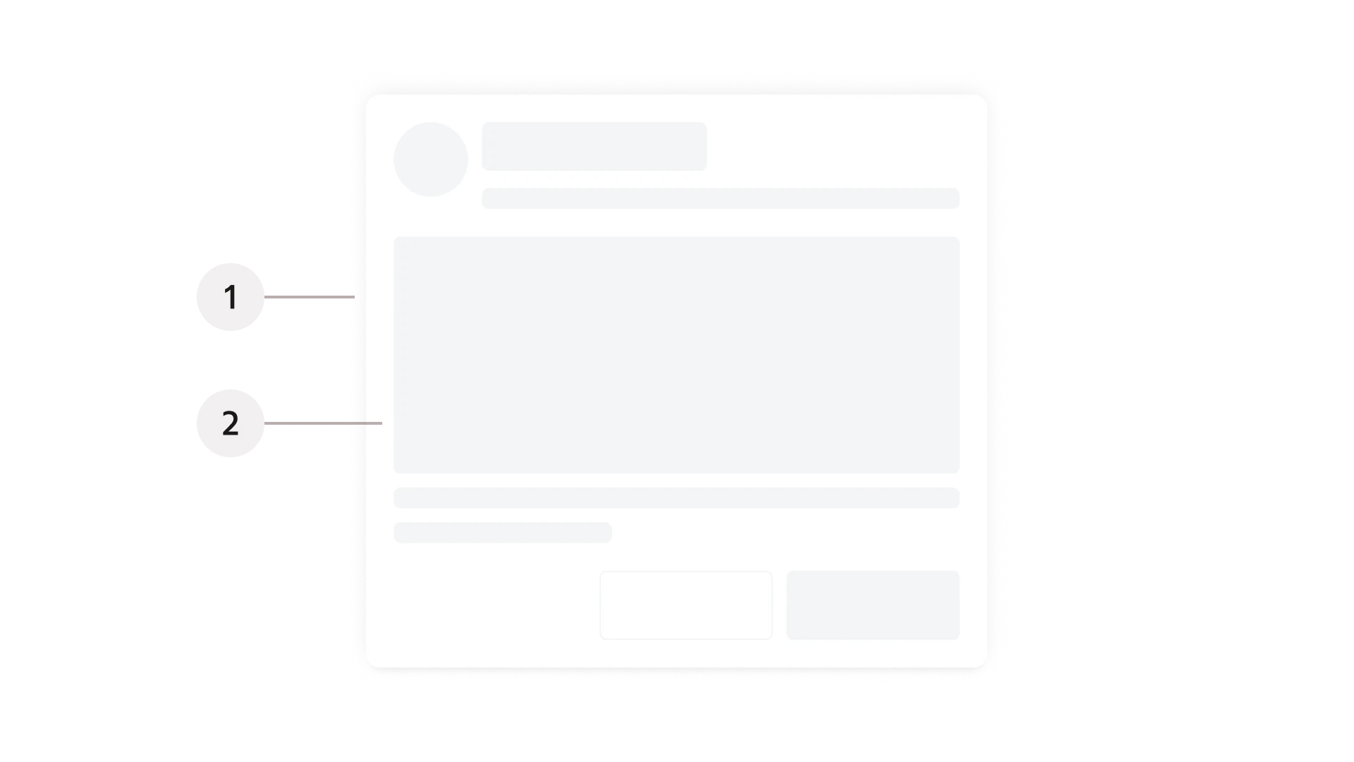
1. Container
2. Content area
### Layout
The content area has no default padding, so add padding in your layout—at least 16 px (p-4) is suggested for primary content.
### Content slot
As the Composable modal is essentially an empty container, add your content in the content slot in Figma and build the layout using design system components.
### Confirming and dismissing
Because composable modal allows for freedom regarding content, make sure to have a clear way to exit and confirm settings within the component. Confirming is typically a primary button at the bottom of the modal. Provide a clear secondary action for dismissing near the primary action, or an X button in the top-right corner.
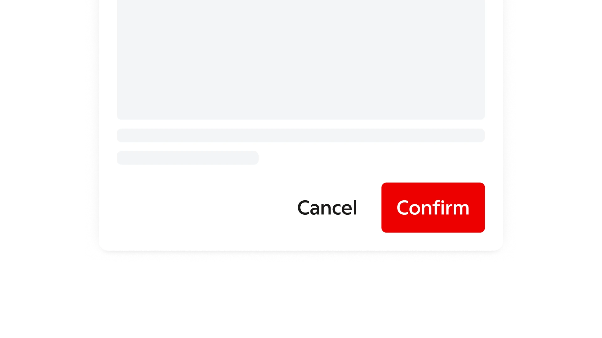
Confirming and dismissive actions in a footer section.
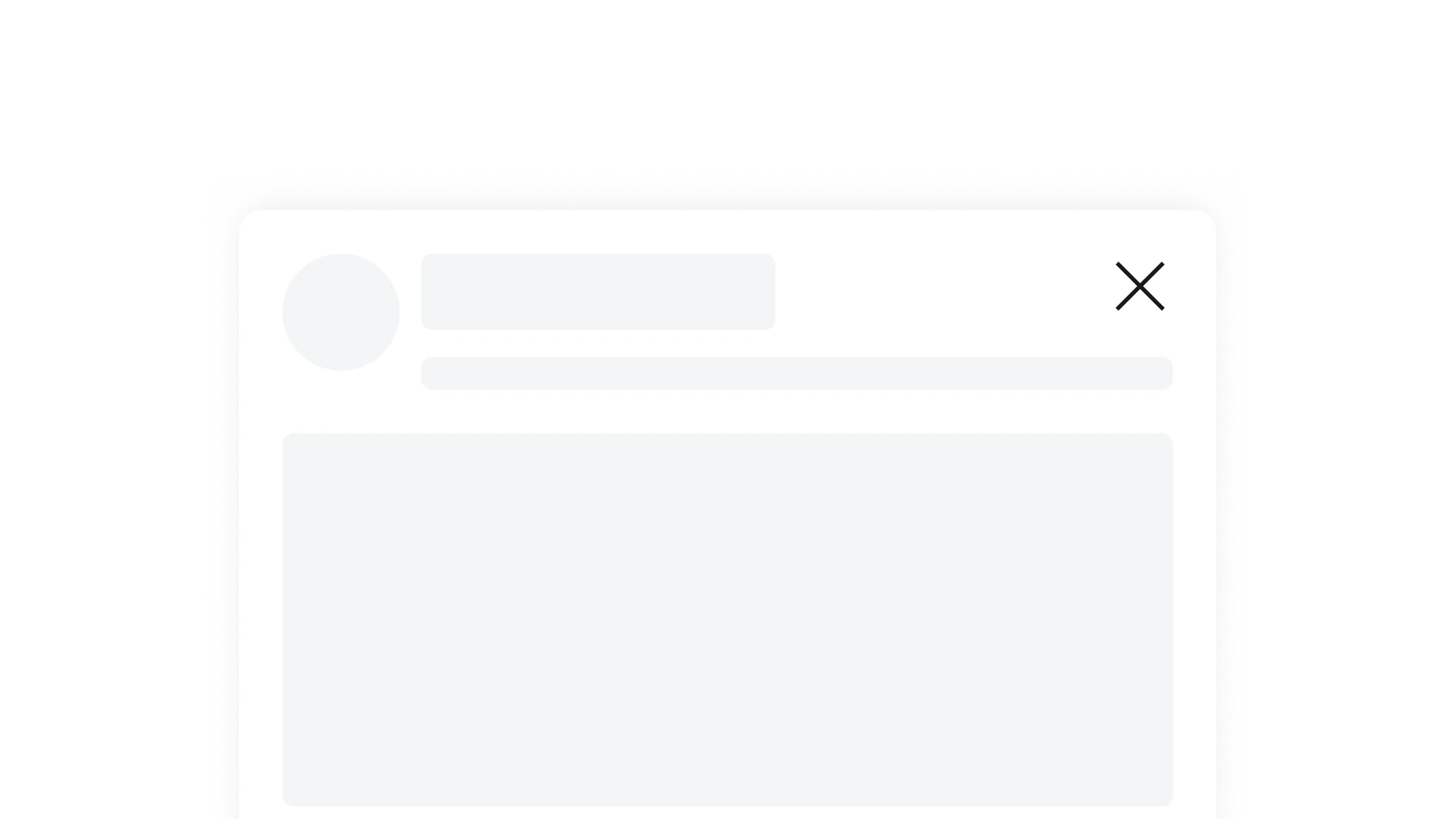
A dismissive action as an icon button in the upper right corner.
### Accessibility
As layout and function are largely free, make sure accessibility is ensured. Keep in mind requirements such as focus handling, meaningful title, logical focus order and keyboard reachability.
***
## Behaviour
### Sizing
The Composable Modal expands horizontally in smaller devices with a margin from the borders of the container to the edges of the screen. On larger devices the modal can expand freely but with a maximum width of 640 px. Vertically content determines the length of the container. If the content exceeds the max height, overflow scrolling needs to be handled within the modal body.
---
# Readme / API
# Composable Modal
Composable Modal is a modal container that allows flexible content layouts. It uses the same modal behavior and accessibility as Dialog, but does **not** enforce the standard header / content / footer structure.
Use Composable Modal for focused tasks that need a custom layout inside a modal. For confirmations, simple forms, and standard "Save / Cancel" flows, use [Dialog](/ai/components/dialog.md). For minor notifications, use [Snackbar](/ai/components/snackbar.md).
## Usage
```tsx
'use client';
import * as React from 'react';
import {
ComposableModal,
ComposableModalTrigger,
ComposableModalContent,
ComposableModalTitle,
ComposableModalDescription,
ComposableModalClose,
} from '@svenskaspel/ui/react/composable-modal';
import { Button } from '@svenskaspel/ui/react/button';
export function Example() {
return (
}>Open Modal
Compose your own layoutBuild whatever layout your scenario needs.
}>Cancel
);
}
```
---
## API
| Component | Description |
| ---------------------------- | ------------------------------------------------------------------------------------------------------ |
| `ComposableModal` | Root container; controls open state and context. Accepts Base UI `Dialog.Root` props. |
| `ComposableModalTrigger` | Element (e.g. a button) that opens the modal. Use `render={}` to swap the rendered element. |
| `ComposableModalPortal` | Teleports overlay + content to `document.body` for stacking. |
| `ComposableModalOverlay` | Semi-transparent backdrop with fade in / out animations (Base UI `Dialog.Backdrop`). |
| `ComposableModalContent` | Container for your custom layout. **No default padding** — add your own (at least `p-4`). |
| `ComposableModalTitle` | Unstyled accessible title (required for ARIA labeling). Style via `className`. |
| `ComposableModalDescription` | Unstyled accessible description. Style via `className`. |
| `ComposableModalClose` | Close button / trigger; can be placed anywhere in your layout. Use `render={}` to swap element. |
### Preventing dismissal
Base UI does not expose Radix's `onInteractOutside` / `onEscapeKeyDown` events on the popup. To build a mandatory modal, combine `disablePointerDismissal` on the root (blocks outside-press dismissal) with an `onOpenChange` handler that inspects `eventDetails.reason` and calls `cancel()` for the events you want to block:
```tsx
{
if (!open && details.reason === 'escape-key') {
details.cancel();
}
}}
>
...
```
`preventUnmountOnClose()` only retains the DOM after closing; it does not cancel dismissal. See [Dialog dismissal](/ai/components/dialog.md#preventing-dismissal).
The `reason` field can be `'trigger-press' | 'outside-press' | 'escape-key' | 'close-press' | 'focus-out' | 'imperative-action' | 'none'`.
---
## Anatomy
Composable Modal provides two slots:
- **Container** (`ComposableModalContent`) — outer wrapper with sizing, animation and shadow.
- **Content area** — your custom layout, rendered as children of the Container.
The component does not enforce header or footer regions. Structure your content with a clear hierarchy and reading order.
---
## Layout
The content area has no default padding. Add padding in your layout — at least `16 px` (`p-4`) is suggested for primary content.
Confirming and dismissing actions are typically:
- A primary button at the bottom of the modal, with a clear secondary action for dismissing nearby, or
- An "×" icon button in the upper right corner.
Always ensure there is a clear way to exit the modal.
---
## Sizing
Composable Modal expands horizontally on smaller devices with a margin from the screen edges. On larger devices the modal can expand freely up to a **maximum width of 640 px**. Vertical length is determined by content. If the content exceeds the max height (`100vh − 2rem`), handle overflow scrolling within your own body element.
---
## Accessibility
Built on Base UI's dialog primitives:
- Proper focus trapping
- ARIA roles and attributes (provide `ComposableModalTitle` for an accessible name)
- Keyboard navigation (Esc to close, unless prevented)
Because layout is largely up to you, take care to ensure:
- Focus handling
- Meaningful title via `ComposableModalTitle`
- Logical focus order
- Keyboard reachability for all actions
---
## Queueing in apps
To avoid being interrupted when a regular `Dialog` opens, render `ComposableModal` through the application-wide dialog queue from `@svenskaspelab/nova-foundation` (`useDialog` / `showDialog`). See the [Nova Docs](https://nova.internt.svenskaspel.se/api/foundation/docs/dialog) for the queue API and integration patterns — the queue's outer `