---
package: "@svenskaspel/ui"
version: "4.4.0"
document_type: "component-documentation"
source: "@svenskaspel/ui/docs/dialog.md"
canonical_url: "/components/dialog"
usage_source: "src/app/(docs)/components/dialog/page.mdx"
---
# Dialog
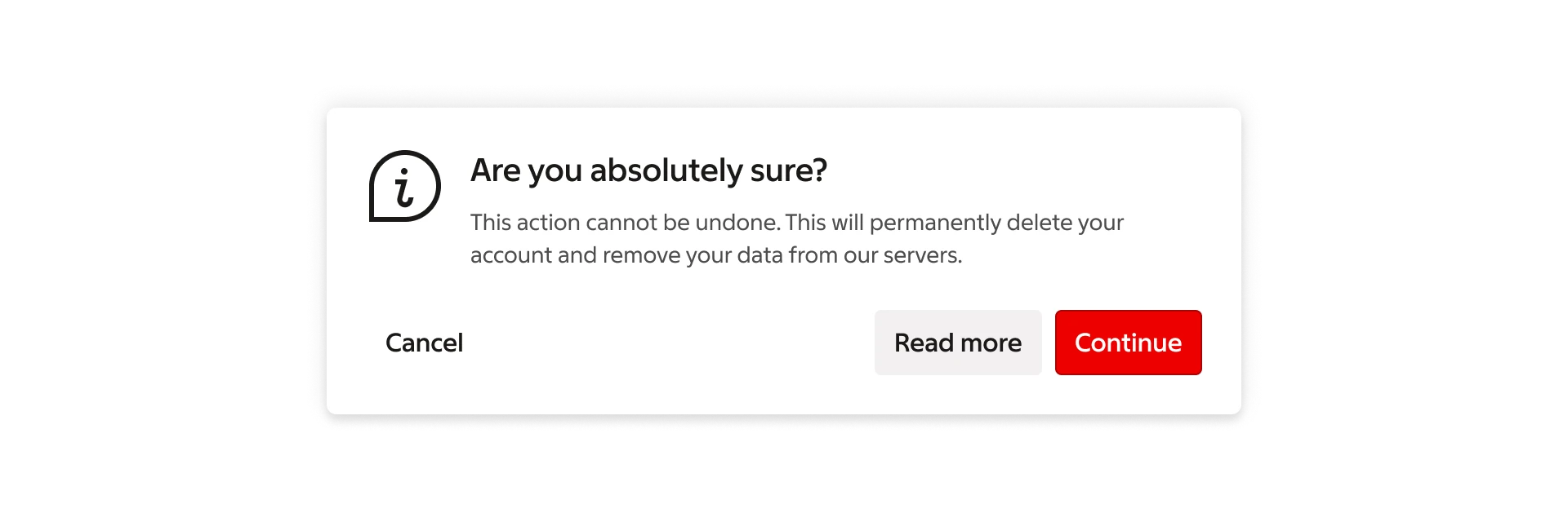
Dialog is a “conversation” between the system and the user. It is prompted when the system needs input from the user or to give the user urgent information concerning their current workflow.
***
## Usage
A dialog is purposefully interruptive as it disables all functionality of the site while waiting for the user to take action. With this in mind, dialogs should be used sparingly.
### When to use what
Use dialogs to present critical information that requires a clear decision or acknowledgement.
They can also be used to inform users about errors that block normal site functionality.
#### Dialog
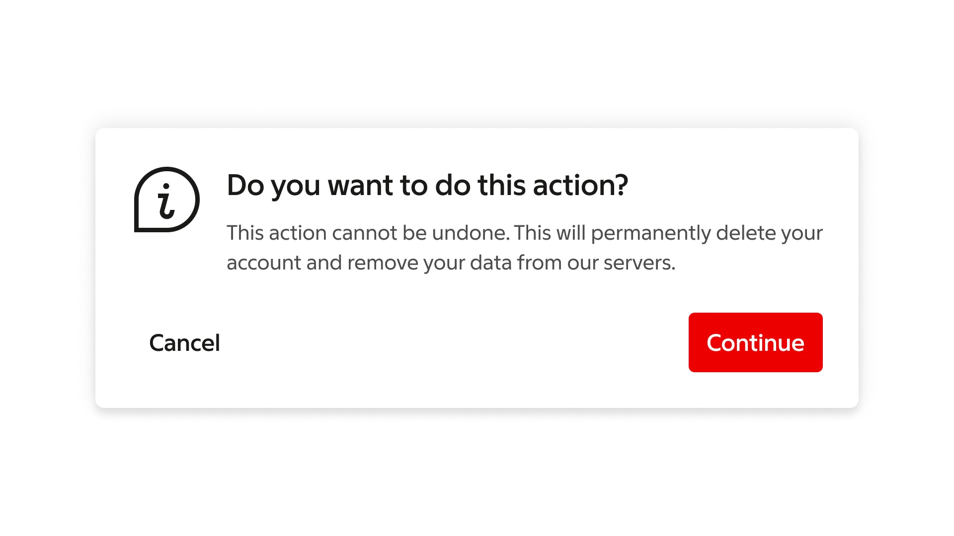
Dialogs block app usage until the user takes a dialog action or exits the dialog
(if available).
Dialogs have highest priority.
#### Snackbar
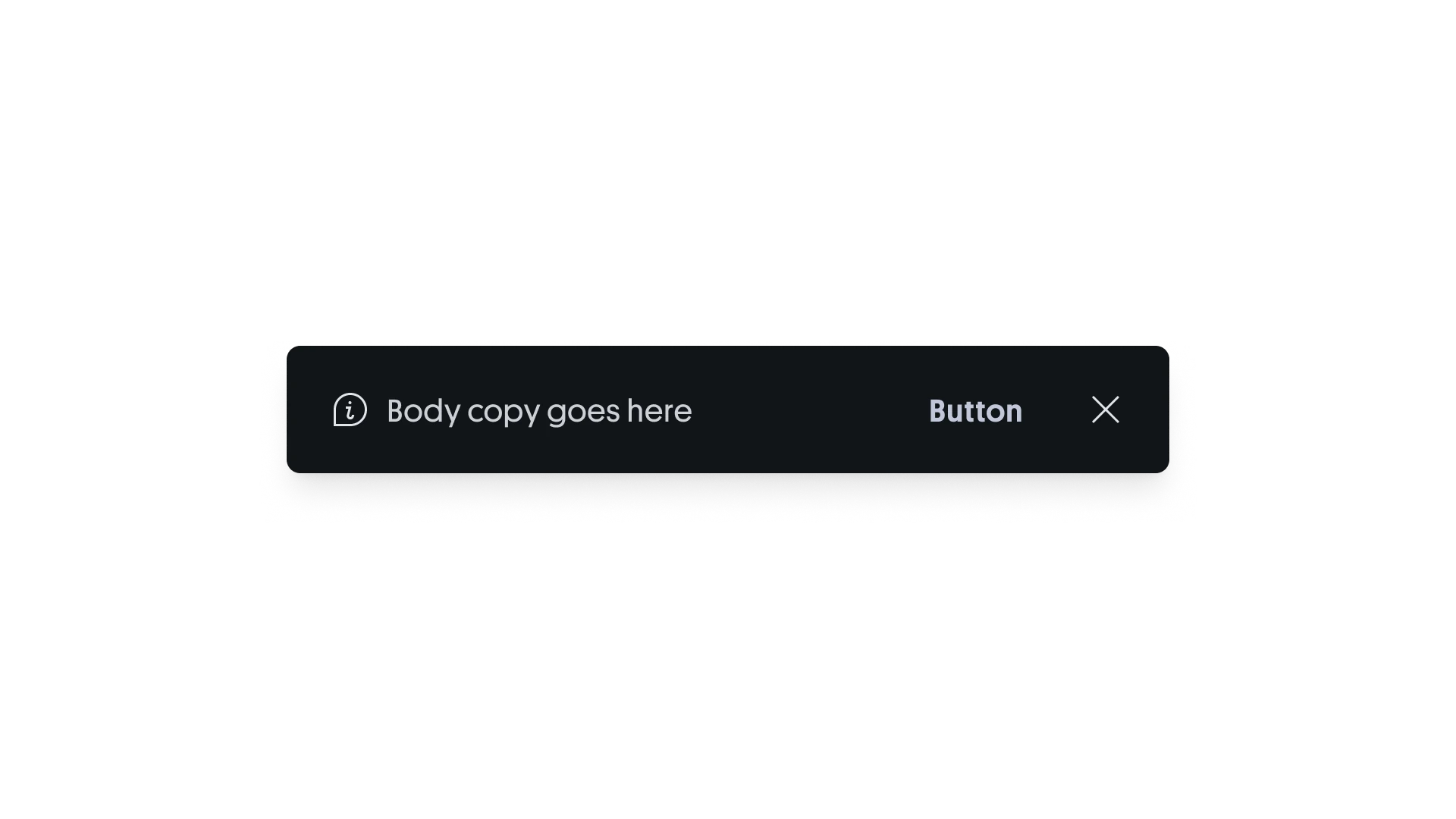
A snackbar stays visible briefly or until dismissed, depending on the context.
It appears at the bottom of the screen and is used for prominent or medium-priority messaging that doesn’t require a dialog.
#### Tooltip
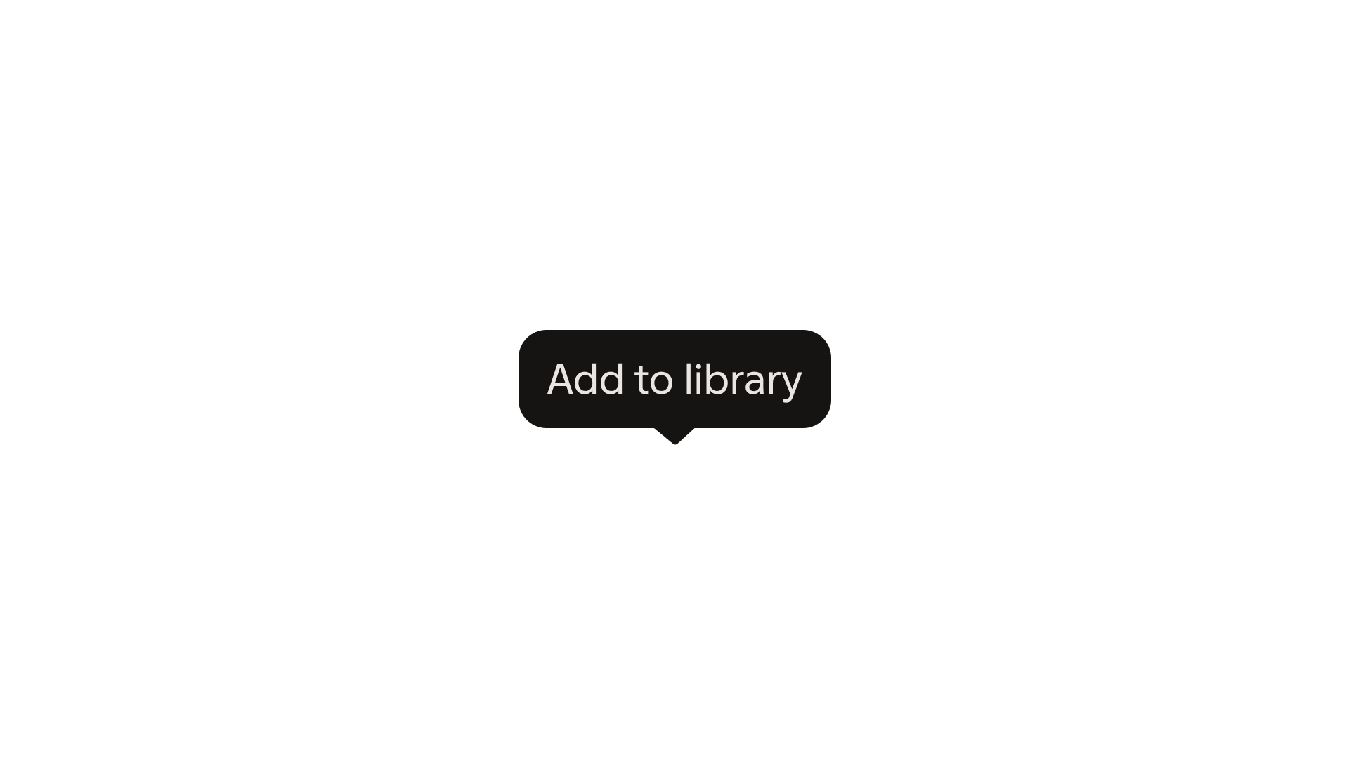
Simple tooltips disappear automatically — on hover out for desktop, or tapping outside on mobile — and are intended for low-priority, supplementary information.
### Dialog types
There are two different types of dialogs. The sizes of dialogs adapt to different screen sizes.
Dialogs are themed depending on the business area and on the information being conveyed.
Follow the guidelines for theming.
#### Alert
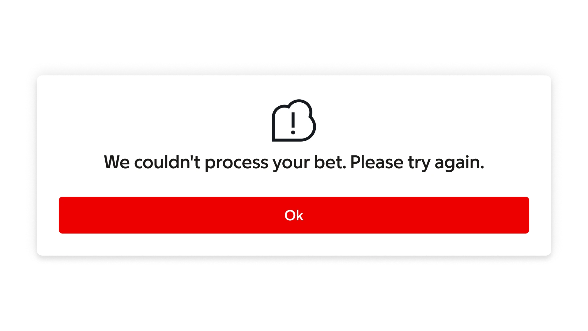
Alert dialogs have a single button for acknowledgement. Error messages are displayed as alerts.
#### Confirmation
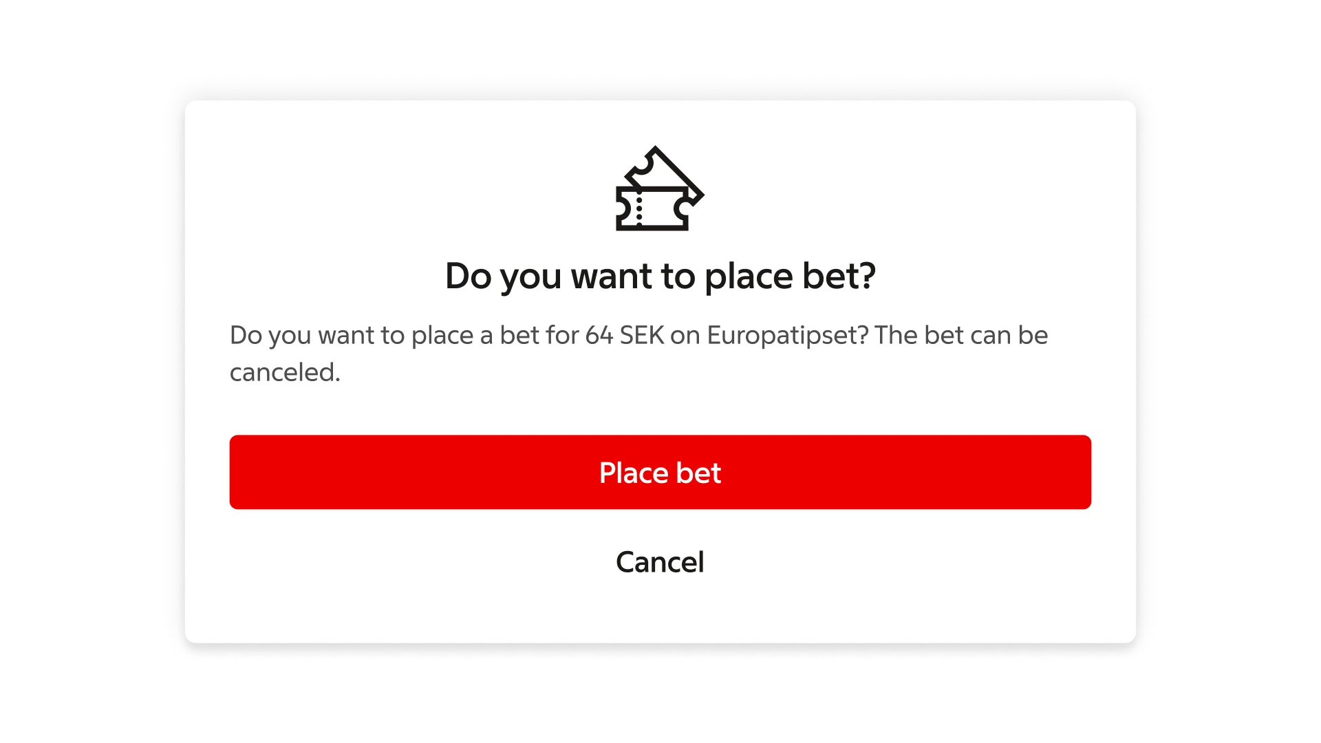
Confirmation dialogs have two buttons: one to confirm and one to dismiss.
***
## Formatting
### Anatomy
Dialogs contain some required elements and some optional elements.
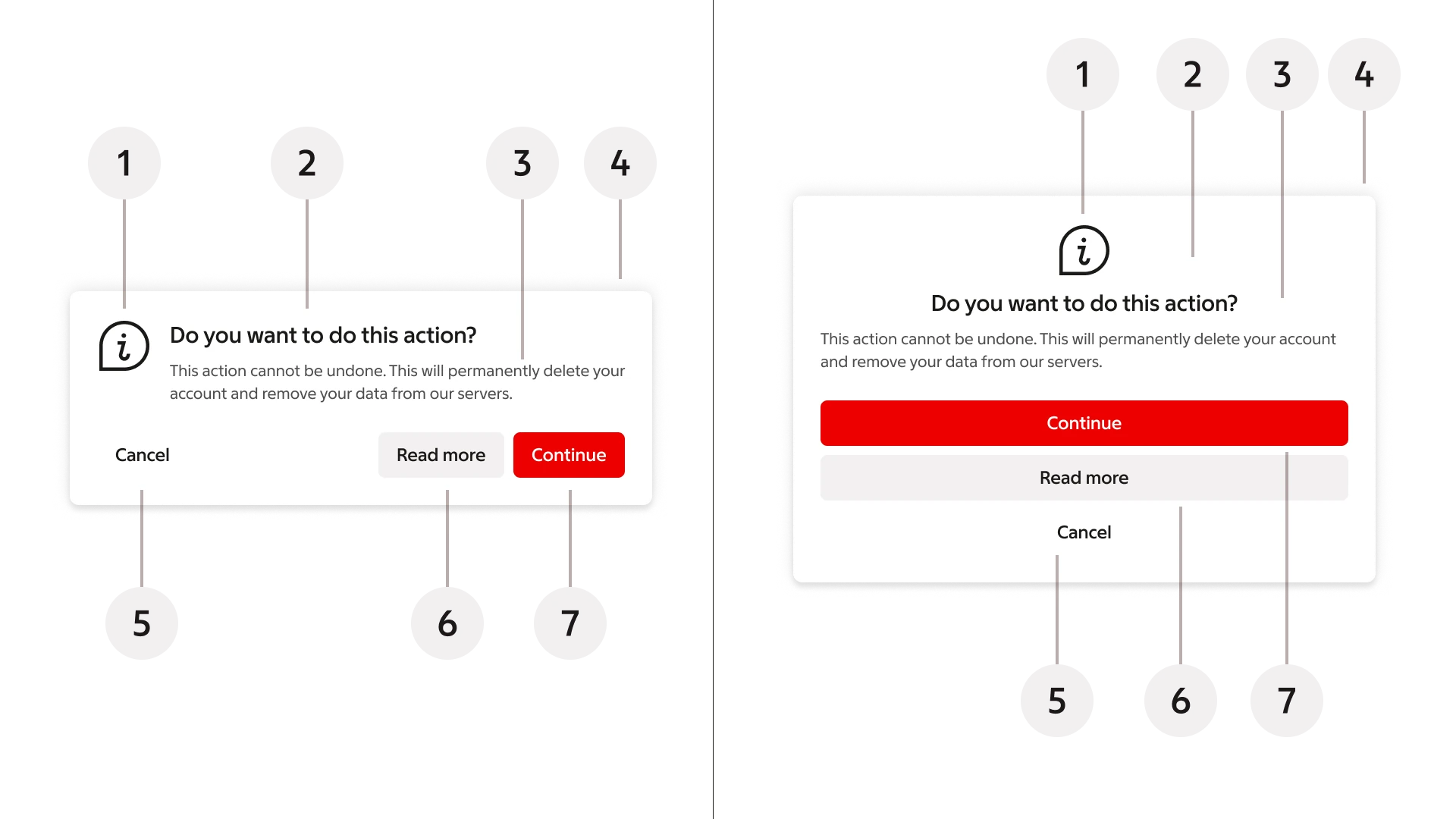
1. Icon (optional)
2. Title
3. Message (optional)
4. Container
5. Dismissive action (optional)
6. Supportive action (optional)
7. Primary action
### Title
A dialog’s purpose should be communicated by its title and button label.
Titles should:
- Contain a brief, clear statement or question
- Avoid apologies (“Sorry for the interruption”), alarm (“Warning!”), or ambiguity (“Are you sure?”)
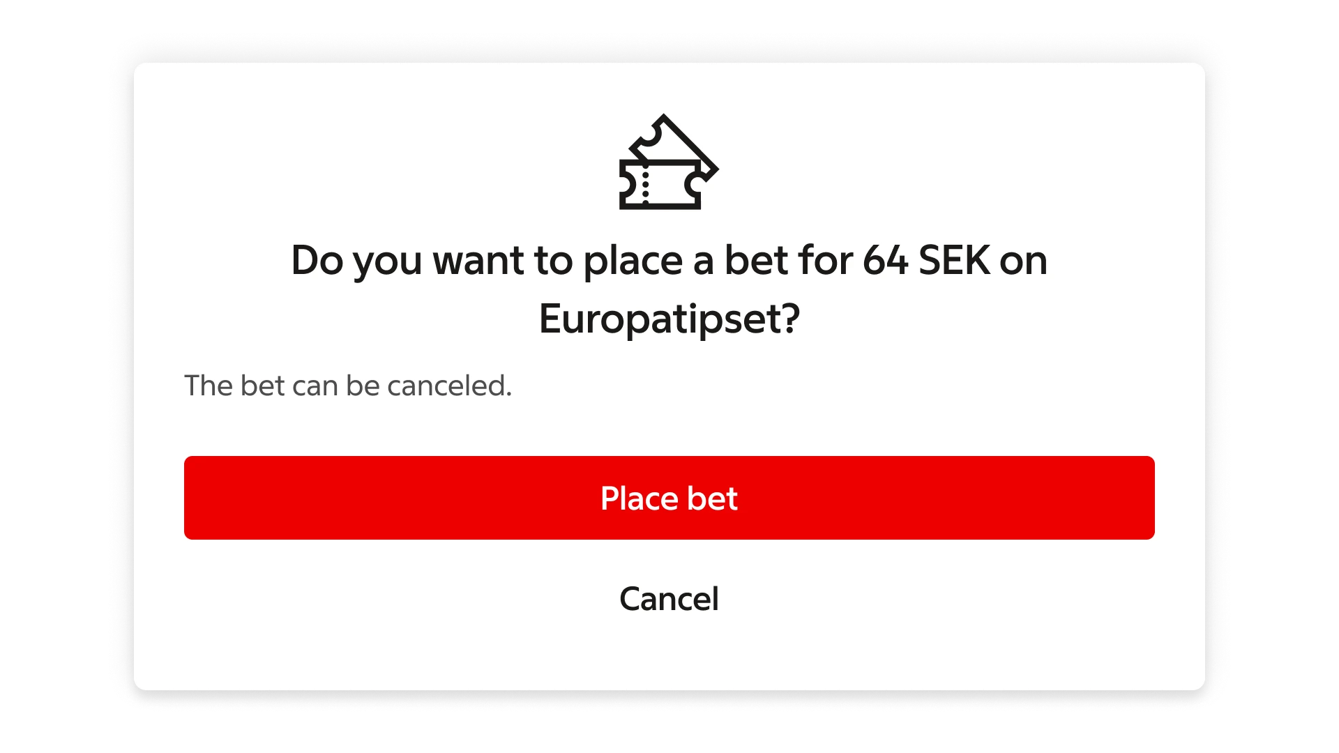
> **Do:** This dialog title poses a specific question, concisely explains what’s involved in the request, and provides clear actions.
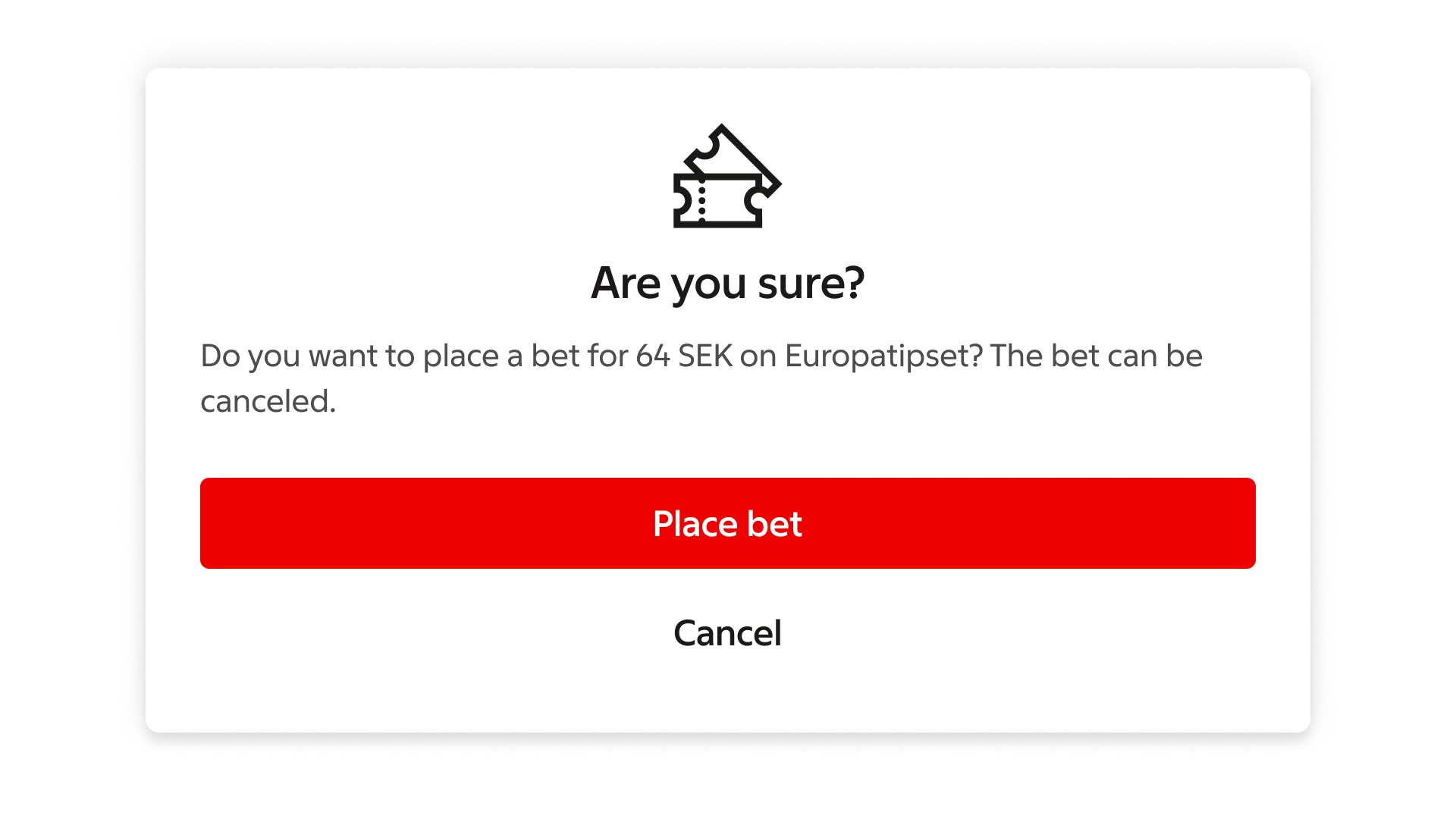
> **Don't:** Don’t use dialog titles that pose an unclear question.
### Buttons
Confirmation dialogs use two buttons, arranged differently depending on screen size.
Alert dialogs use a single button for acknowledgement.
#### Side-by-side
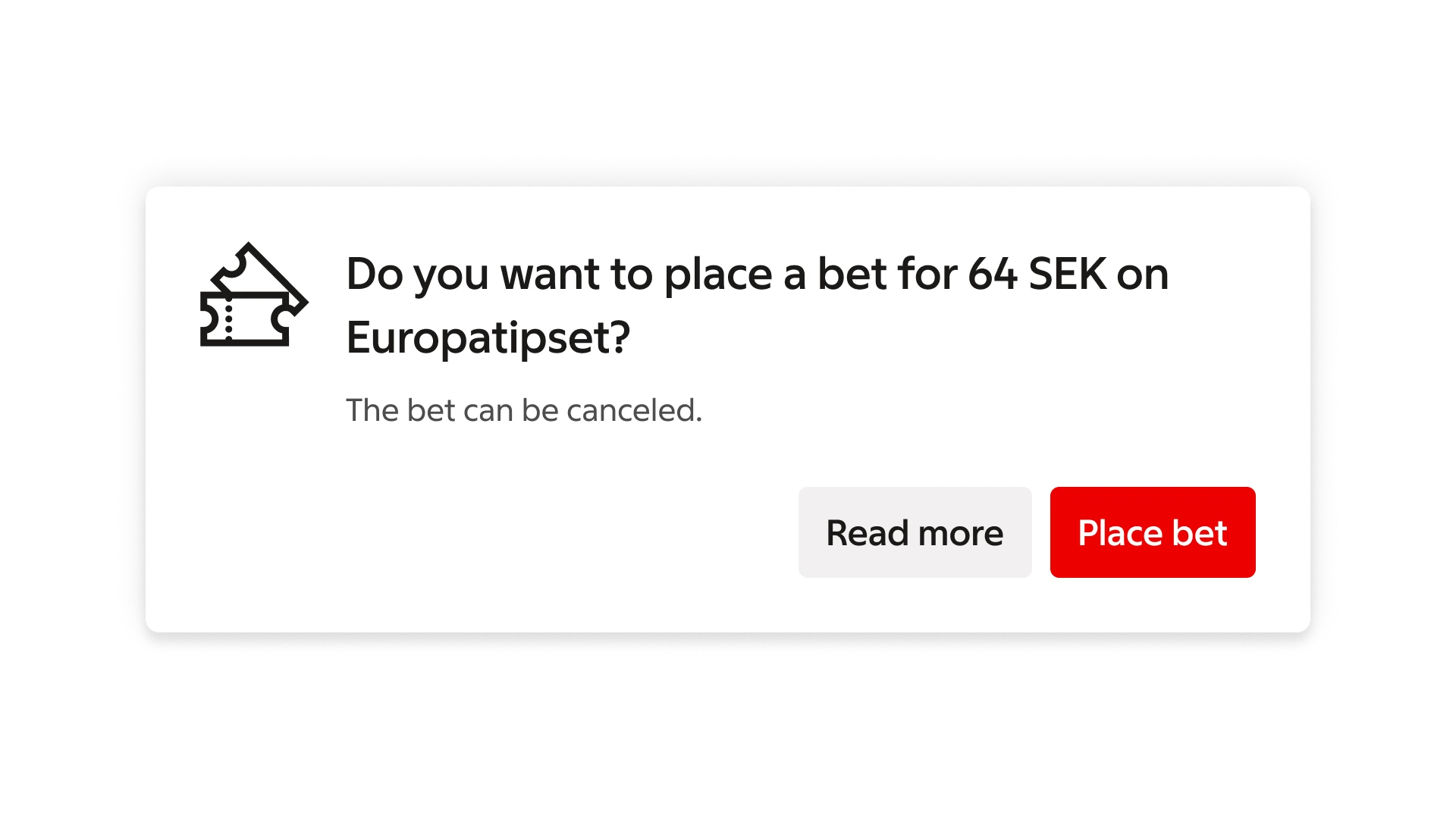
The recommended arrangement of buttons in dialogs is to place them side-by-side.
Confirming actions appear to the far right.
#### Stacked
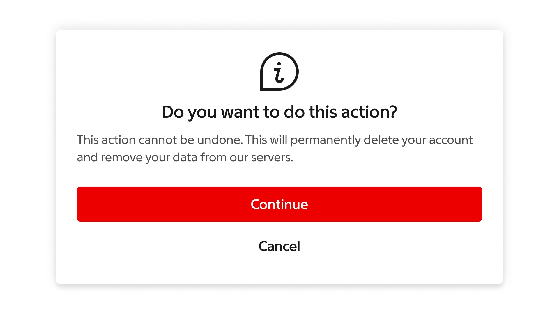
Stacked buttons accommodate longer button labels.
Confirming actions appear above dismissive actions.
#### Solo
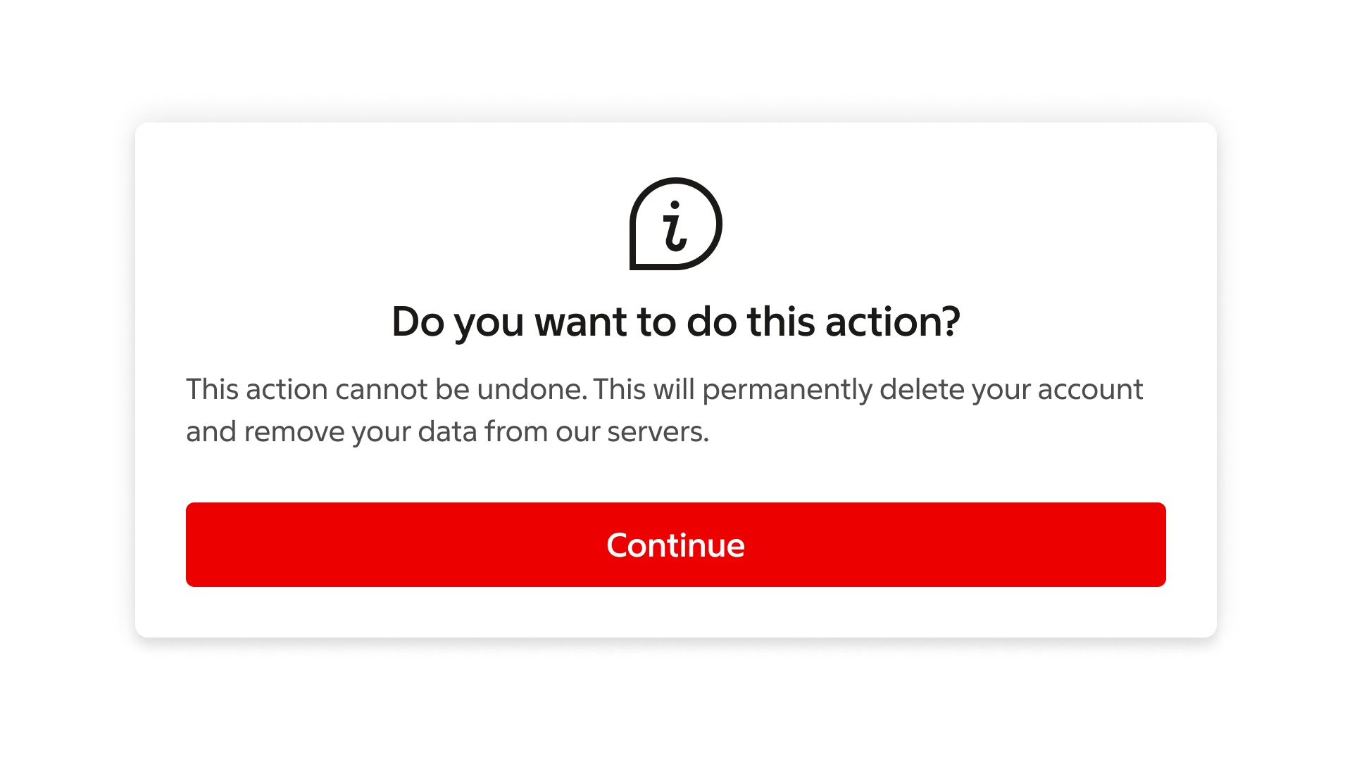
Alert dialogs only have a single button.
### Button labels
Dialogs should be closed through a clear user action. Each action should clearly communicate the outcome.
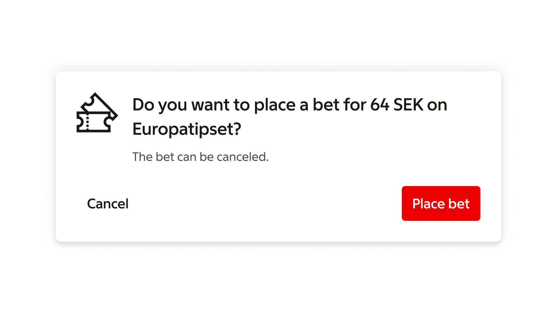
> **Do:** The action “Place bet” indicates the outcome of the decision.
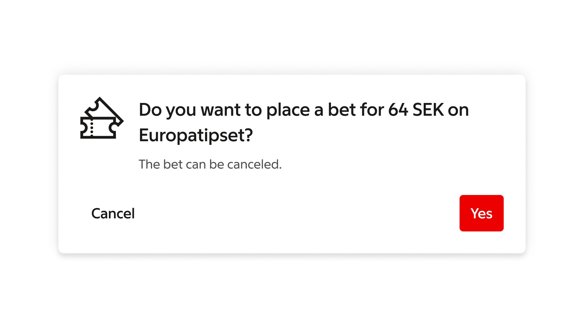
> **Don't:** Don’t use action text that fails to indicate what the selection will do. “Cancel” and “Place bet” better indicate what will occur in this dialog.
### Button choices
To minimize confusion, make sure to only present choices that are clear to users.
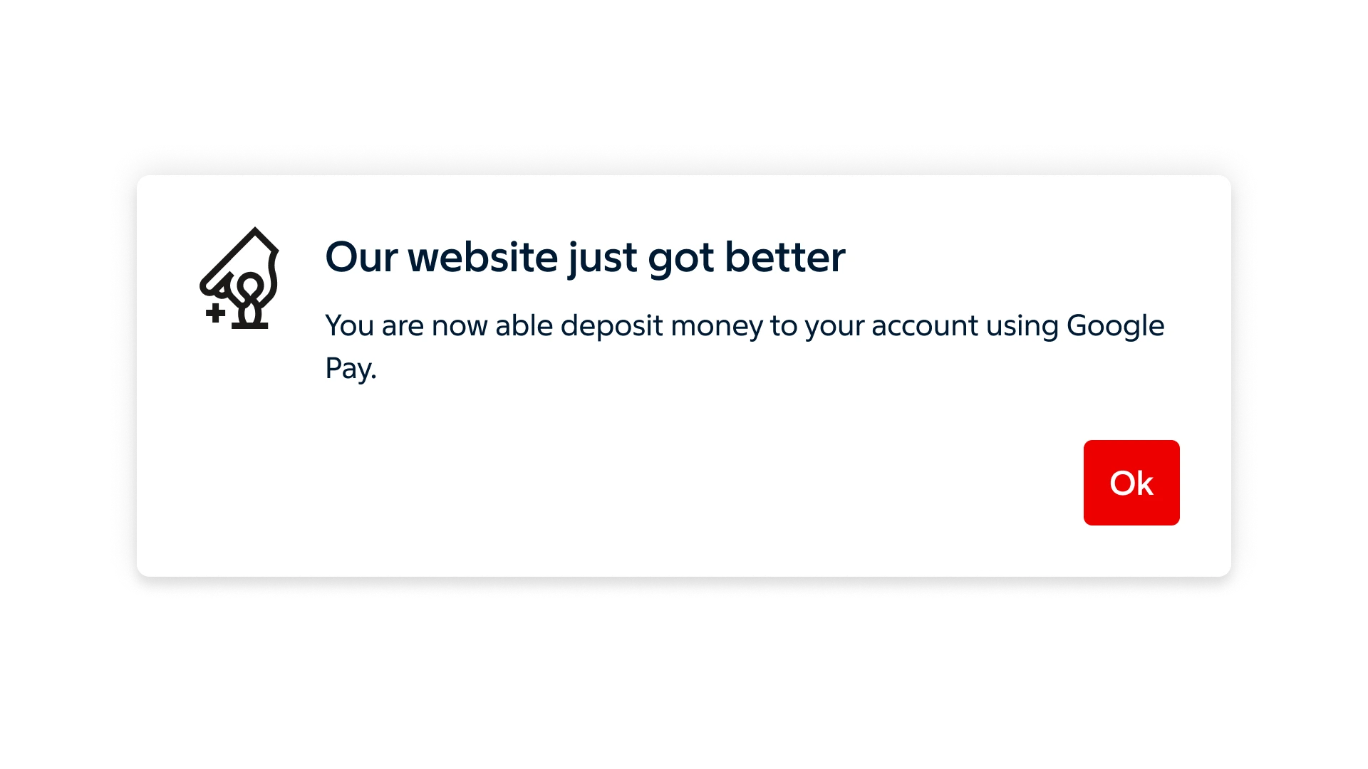
> **Do:** Make sure to present choices that are clear to the user.
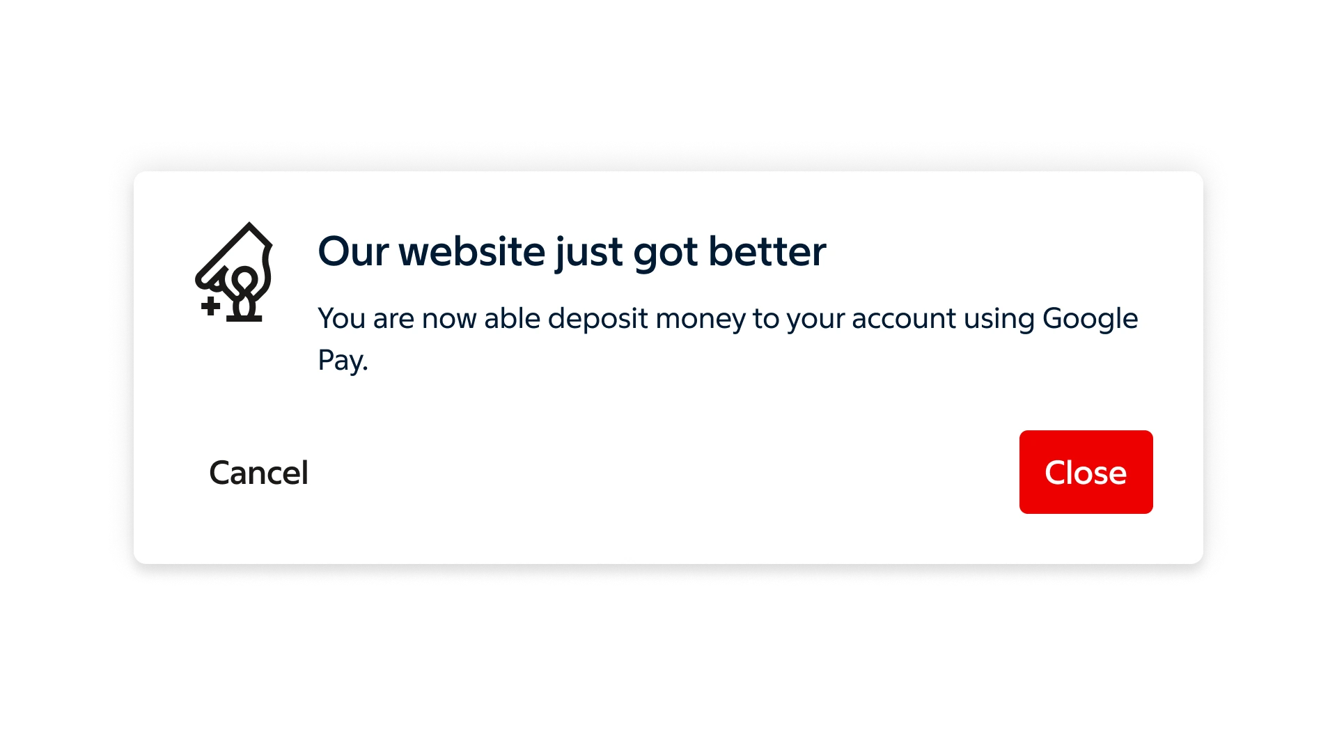
> **Don't:** Avoid unclear choices. "Close" is not meaningful here and conflicts with the dismissive action. Use a single dismissive action like "Ok" instead in this example.
### Button placement
To avoid frustration and confusion, always place dismissive actions to the left of confirming actions (if the buttons are placed side-by-side). If buttons are stacked, always place the dismissive action below.
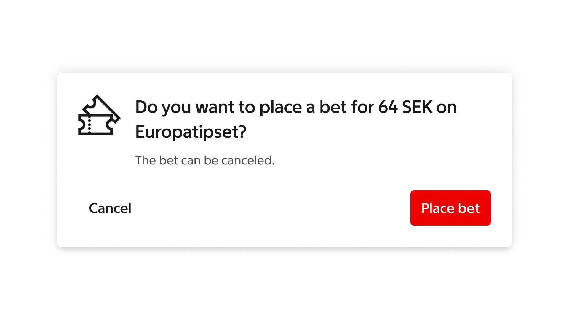
> **Do:** Place dismissive actions to the left of confirming actions.
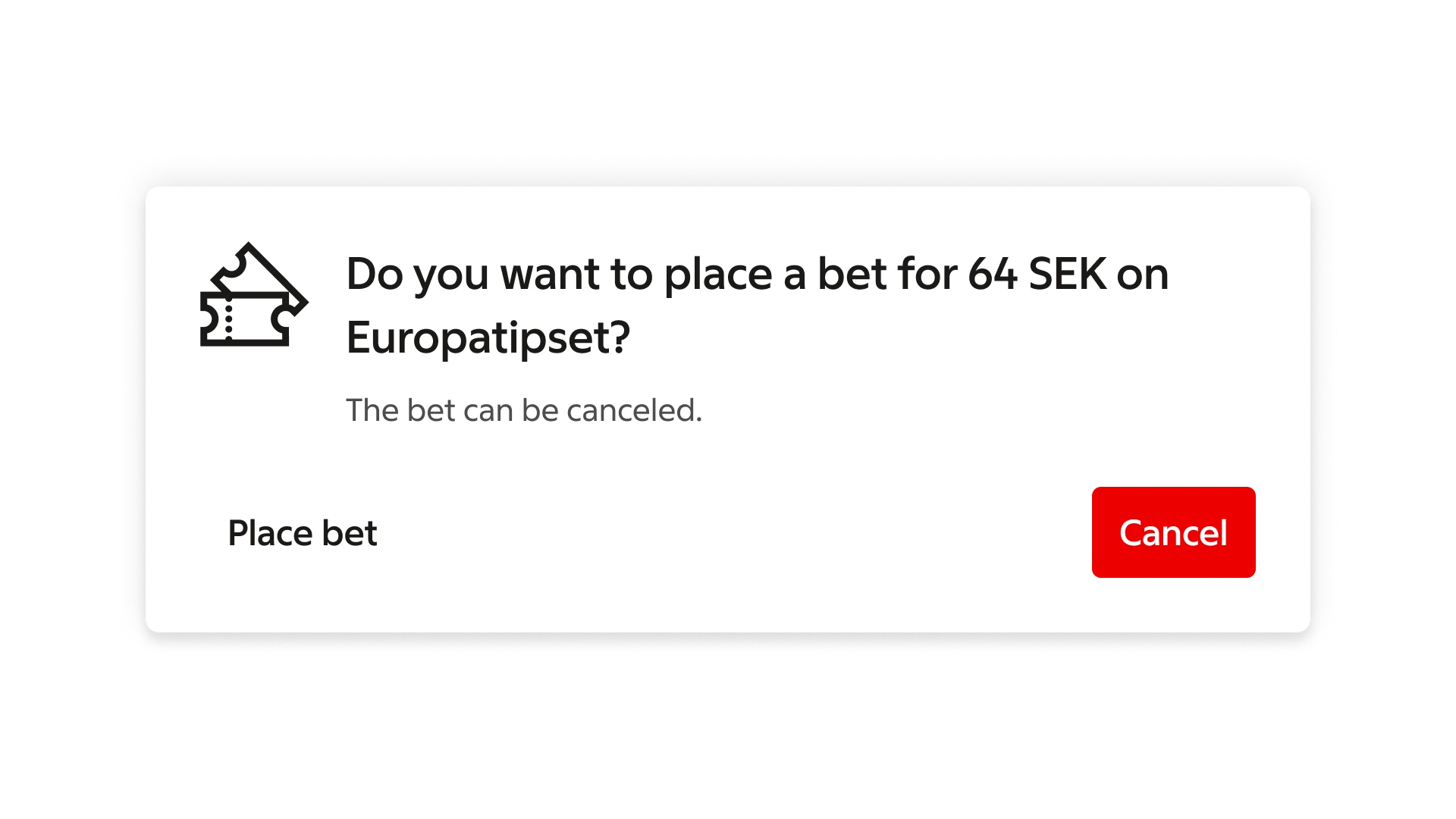
> **Don't:** Don’t place dismissive actions to the right of confirming actions.
### Elevation
Dialogs are displayed at 24dp elevation and display a shadow. They appear above other content and typically have a scrim below them that covers all content.
***
## Behaviour
### Scaling and adaptation
Dialogs adapt their layout based on screen size.
On smaller screens, actions are stacked vertically. On larger screens, they are arranged horizontally.
Dialogs should not exceed 560 px in width on smaller screens and 640 px on larger screens.
If the content exceeds the available space, the content area becomes scrollable while the header and footer remain fixed.
### Smaller screens
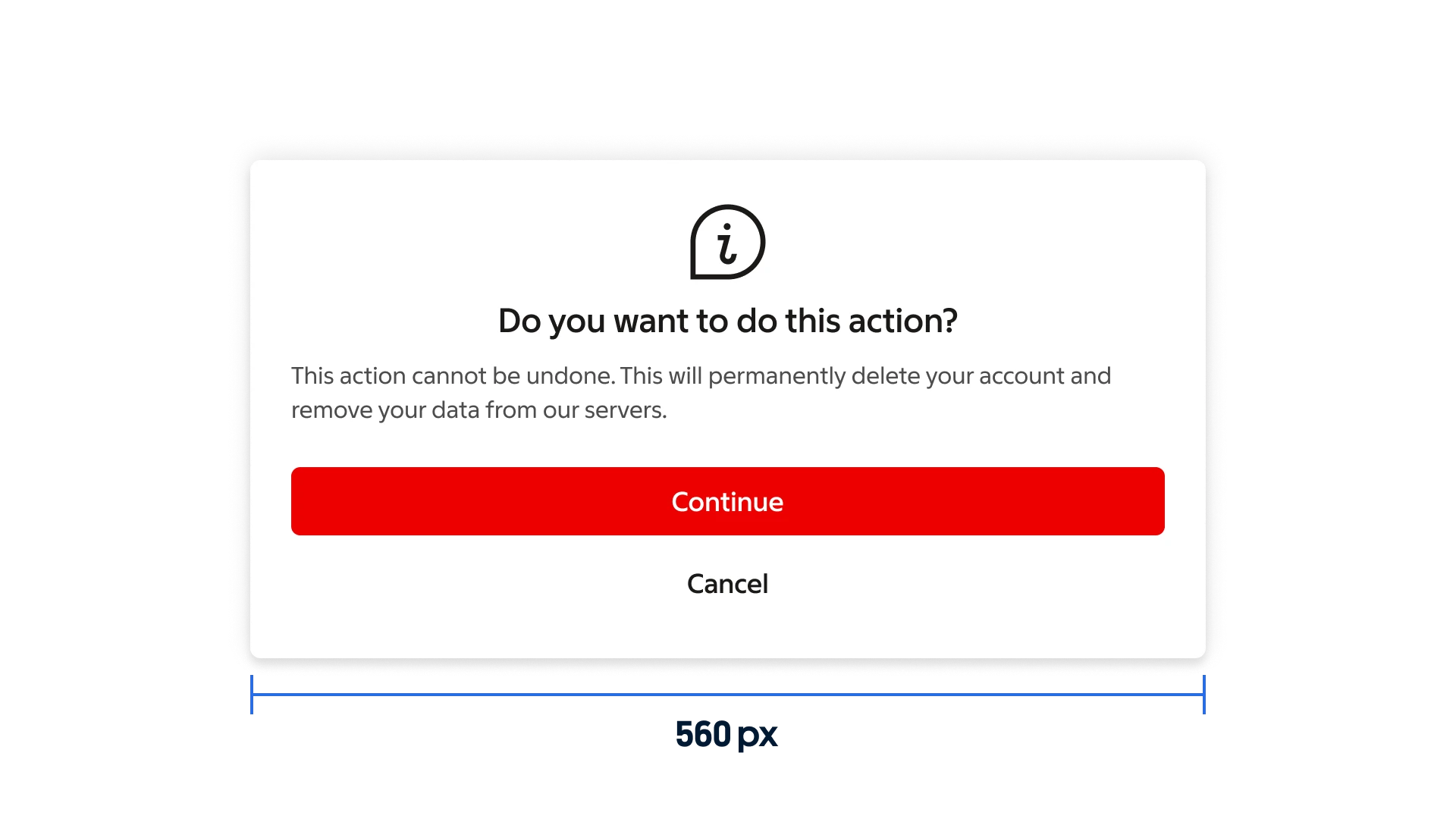
Dialogs can reach a maximum width of 560 px on smaller screens.
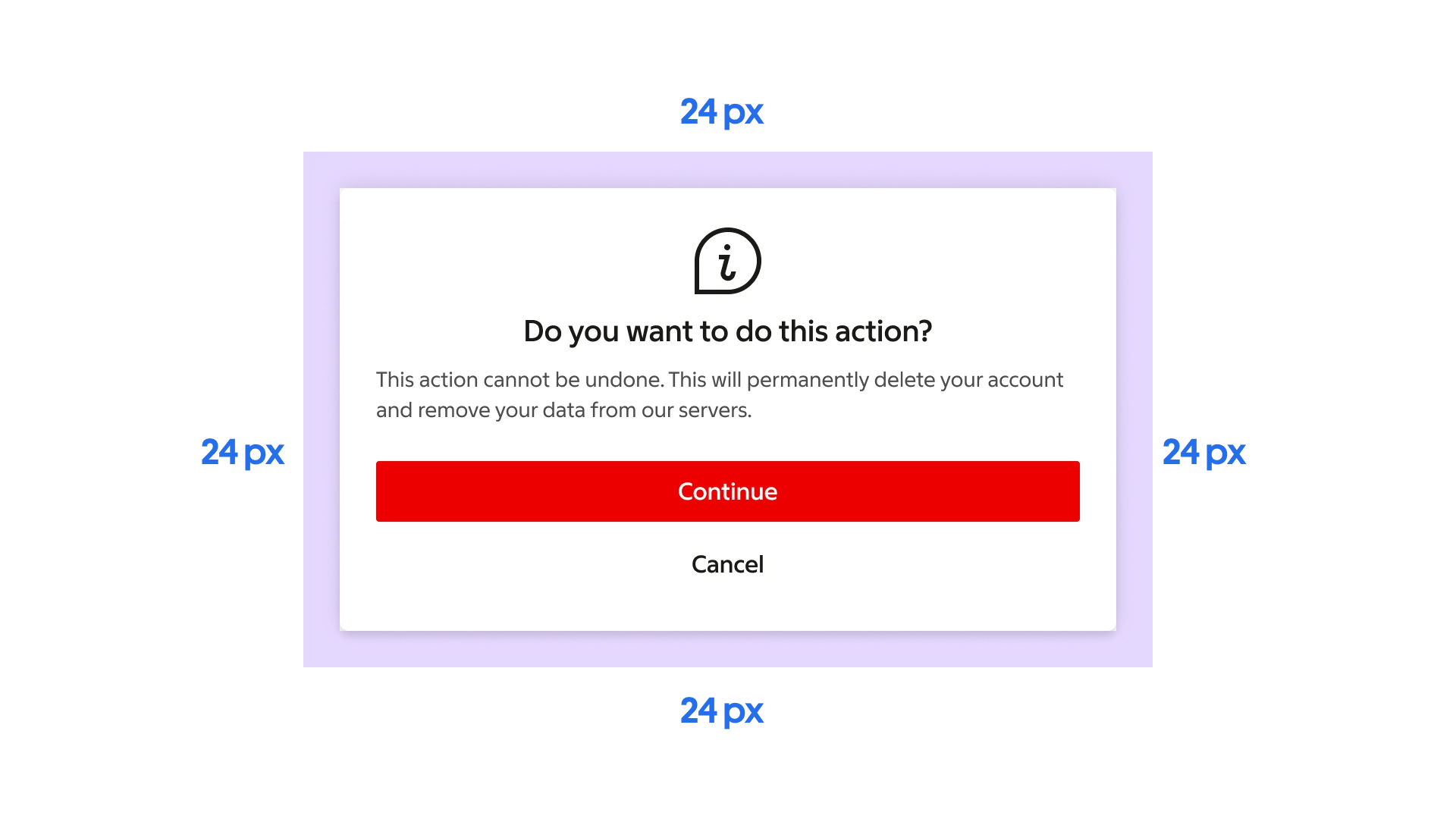
Dialogs maintain a minimum distance of 24 px to each side of the screen.
### Larger screens
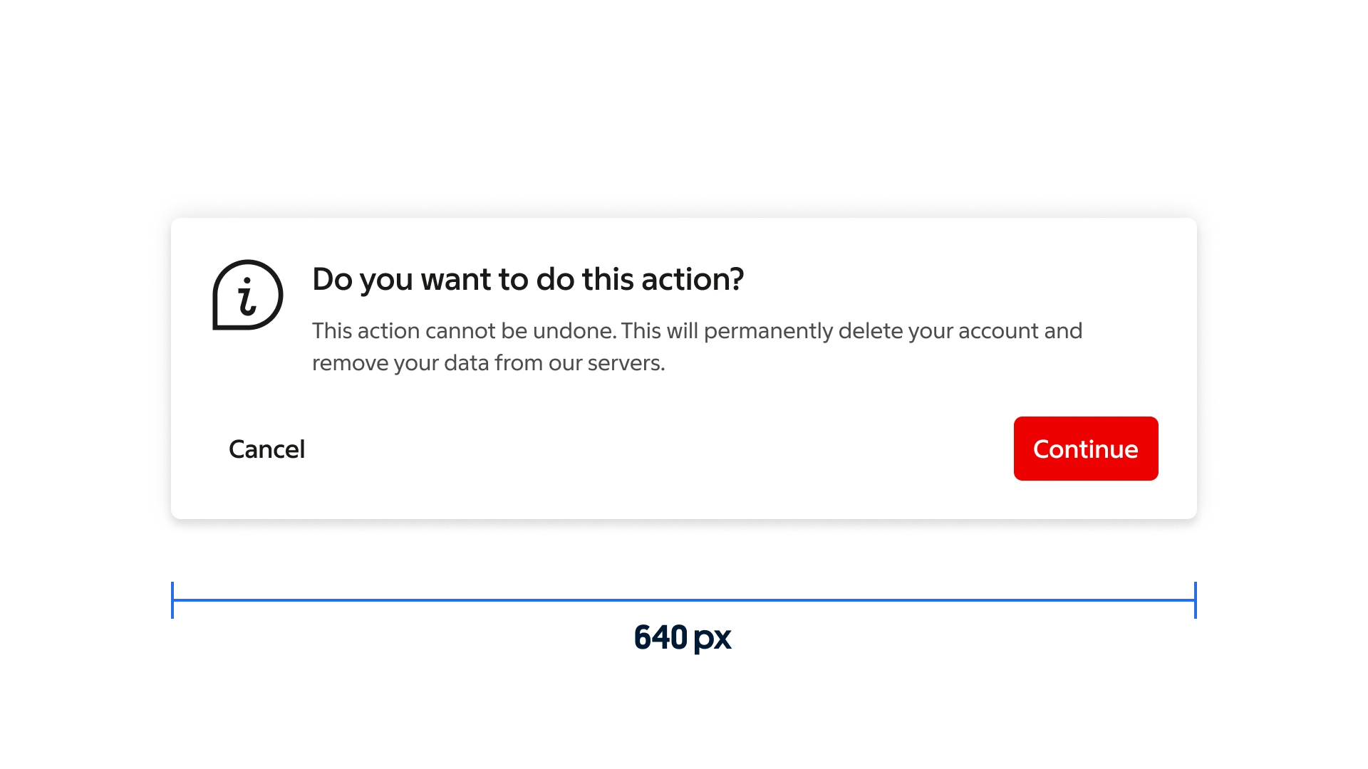
Desktop dialogs can reach a maximum width of 640 px on large screens.
### Scrollable content
Dialogs should avoid excessive scrolling whenever possible.
If the content exceeds the available space, only the content area becomes scrollable, while the header and footer remain fixed to preserve context and access to actions.
Dialogs scroll independently of the background, which remains static.
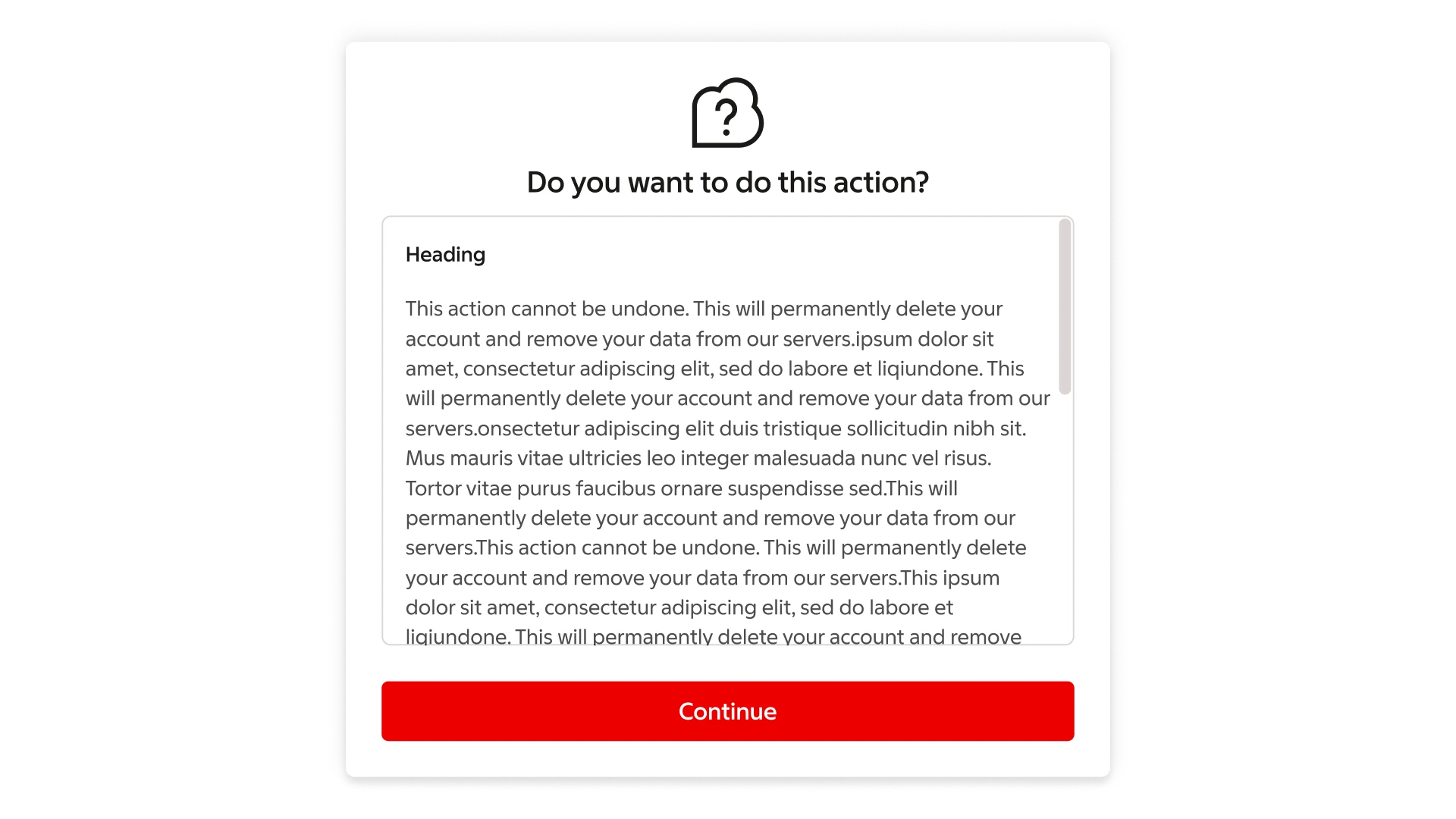
Scrollable body with fixed header/footer
***
## Actions
### Types of actions
Dialogs present a distinct choice to users through their title, content, and available actions. Dialog actions are represented as buttons and allow users resolve what triggered the dialog by confirming, dismissing or acknowledging something.
There are three types of dialog actions:
### Confirming actions
Confirming actions confirm a proposed action. These actions can involve removing something, such as “Delete” or “Remove,” if it suits the context. They are placed to the right of dismissive actions, if the actions are placed side by side, or at the top, if they are stacked.
### Dismissive actions
Dismissive actions dismiss a proposed action, and return the user to the originating screen or step. They are placed to the left of confirming actions, if the actions are placed side by side, or at the bottom, if they are stacked.
### Acknowledgement actions
When user acknowledgement is required to proceed, a single action may be presented
such as “OK”.
### Number of actions
Dialogs should contain a maximum of two actions.
If a single action is provided, it must be an acknowledgement action.
If two actions are provided, one should be a confirming action, and the other a dismissing action.
Providing a third action such as “Learn more” is not recommended as it navigates the user away from the dialog, leaving the dialog task unfinished.
If more extensive information is needed, provide it prior to entering the dialog or after the dialog has been resolved.
***
## Modify
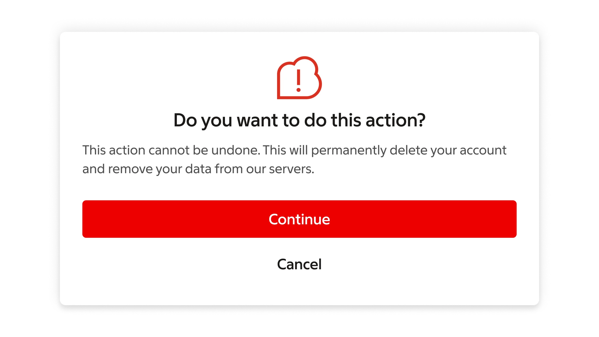
### Error message
When an error message needs to be communicated to the user, an alert is used together with an icon in red.
---
# Readme / API
# Dialog
A versatile, accessible dialog/modal component built with TypeScript, React, and Base UI primitives. It uses custom animations, handles overflow automatically, and is styled with Tailwind CSS.
## Usage
```tsx
'use client';
import * as React from 'react';
import {
Dialog,
DialogTrigger,
DialogContent,
DialogHeader,
DialogIcon,
DialogBody,
DialogFooter,
DialogTitle,
DialogClose,
} from '@svenskaspel/ui/react/dialog';
import { Button } from '@svenskaspel/ui/react/button';
import Information from '@svenskaspel/ui/react/icons/Information';
export function Example() {
return (
);
}
```
---
## API
The primitive wrappers accept their corresponding Base UI props. Header, Icon, and Footer are HTML layout wrappers; Body exposes `children` and `className`. Use `className` to customize styling.
| Component | Description |
| --------------- | ------------------------------------------------------------------------------------------------------------------------------------------------------------------------------------------------------------------------------- |
| `Dialog` | Root container; controls open state and context. Accepts Base UI `Dialog.Root` props. |
| `DialogTrigger` | Element (e.g. a button) that opens the dialog. Use `render={}` to swap element. |
| `DialogPortal` | Teleports overlay + content to `document.body` for stacking. |
| `DialogOverlay` | Semi-transparent backdrop with fade in/out animations (Base UI `Dialog.Backdrop`). |
| `DialogContent` | Modal wrapper with slide/zoom animations and max-height control (Base UI `Dialog.Popup`). |
| `DialogHeader` | Flex container for icon, title, and description. |
| `DialogIcon` | Inline icon slot (e.g. emoji or SVG) next to title. |
| `DialogBody` | Scrollable content area with auto-overflow detection (uses `ScrollArea`). Also serves as Base UI `Dialog.Description` for ARIA. Text is centered on mobile and left-aligned from `sm` up; always left-aligned when overflowing. |
| `DialogFooter` | Actions container; auto-layouts up to 3+ buttons with responsive ordering. |
| `DialogTitle` | Accessible title (`
` role) with base text styles. |
| `DialogClose` | Close button/trigger; provide its visible content and place it in the dialog. Content does not add a close icon automatically. |
### Preventing dismissal
Base UI does not expose Radix's `onInteractOutside` / `onEscapeKeyDown` events on the popup. To build a mandatory dialog, combine `disablePointerDismissal` on the root (blocks outside-press dismissal) with an `onOpenChange` handler that inspects `eventDetails.reason` and calls `cancel()` for the events you want to block:
```tsx
```
The `reason` field can be `'trigger-press' | 'outside-press' | 'escape-key' | 'close-press' | 'focus-out' | 'imperative-action' | 'none'`.
> **Use `cancel()`, not `preventUnmountOnClose()`.** These are not interchangeable:
>
> - `details.cancel()` stops Base UI from handling the event, so the dialog stays open.
> - `details.preventUnmountOnClose()` only keeps the popup mounted in the DOM **after it has already closed**.
>
> Using `preventUnmountOnClose()` here leaves the dialog looking open while `open` is already `false`. Any later `DialogClose` press then becomes a no-op, so the dialog can never be dismissed.
### Text alignment
`DialogBody` centers its content on small screens and switches to left-aligned from the `sm` breakpoint up (`text-center sm:text-left`). This matches `DialogHeader`, so the title and body stay visually consistent.
When the content is tall enough to overflow, the body becomes a scrollable panel and the content is **always left-aligned**, at every breakpoint. Centered text is hard to read in a scrolling block, so this is intentional and not configurable.
If you need left alignment on mobile too — for example for lists, form labels, or legal copy — pass `className="text-left"`:
```tsx
This stays left-aligned on every screen size.
```
`className` is merged with `tailwind-merge`, so `text-left` replaces the default `text-center` rather than fighting it. Any alignment utility works the same way, including responsive variants such as `sm:text-center`.
> Alignment overrides only apply while the body is **not** overflowing. Once the content scrolls, the inner content wrapper enforces `text-left` and wins over an alignment class passed to `DialogBody`.
### Special Props
- **DialogBody**: no extra props, but measures overflow and applies a scrollbar via `ScrollArea`. You can style the overflow container via `className`, including text alignment (see [Text alignment](#text-alignment)).
- **DialogClose** / **DialogTrigger**: accept `className` and `render={}` to render as a custom element.
---
## Animations
All opening/closing animations are defined via the `dialogAnimationsClasses` constant:
- Fade & zoom combined
- Slide in/out from center offsets
- Controlled by Base UI `data-open` / `data-closed` attributes
Feel free to override or extend via `className`!
---
## Accessibility
Built on Base UI's dialog primitives, so you get:
- Proper focus trapping
- ARIA roles & attributes
- Keyboard navigation (Esc to close)
---
## Styling & Customization
Use Tailwind's utilities or custom classes via `className` on any sub-component. For deep theming, wrap with your preferred theme provider.
---
## Dialog queuing in apps
The Dialog system provides a lightweight queue-based dialog system for Next.js apps and should always be used instead of rendering Dialogs directly in your components.
Read more in the [Nova Docs](https://nova.internt.svenskaspel.se/api/foundation/docs/dialog).
---