Components
LoaderUsage
Loader provides feedback while work is in progress and the completion time is unknown. Start with the loading framework below to choose the right feedback for the task.
Loading principles
Invisible
Show ready content immediately. Keep useful content visible during refresh and use caching or preloading where appropriate. Avoid a loader that only flashes briefly, and never delay available content to complete an animation.
Lightweight
Use the least intrusive feedback that explains the wait. Use Skeleton when the incoming layout is known, Loader when duration is unknown, and Button’s built-in Loading state for button actions. Keep feedback close to the affected area.
Choreographed
Coordinate the indicator, status message and transition to the result as one sequence. Motion should explain change and create continuity. Around money and betting, keep feedback calm and factual; never imply success before it is confirmed.
Content already available | Show it immediately; no loader |
Known incoming layout | Skeleton |
Button action | Button’s built-in Loading state |
Unknown completion time | Loader; Spinner by default |
Measurable progress | Determinate progress |
Longer wait | Explain the step, outcome, and recovery. |
Loader variants and sizes
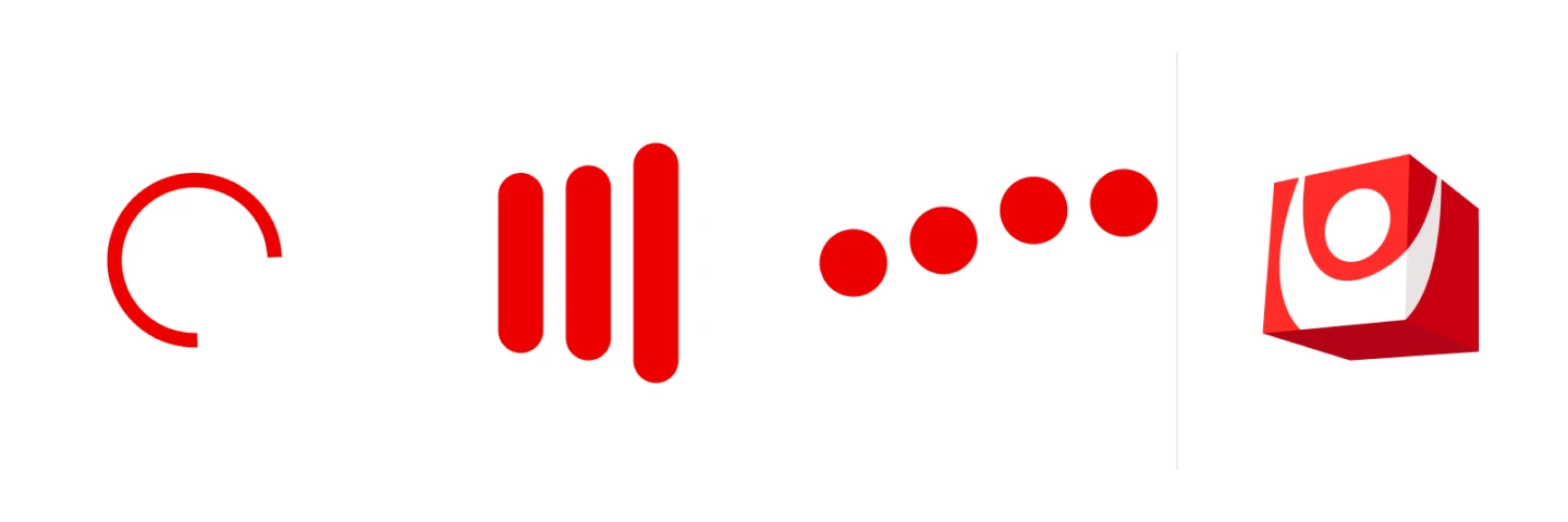
Use Spinner by default. Choose another variant only for an established context, not to imply a different waiting time. Select size by the affected region, not duration. Preserve intrinsic proportions; Dots has wider bounds.
Spinner is the default for general loading. Bars provides a processing metaphor when the remaining duration is unknown. Variant choice does not indicate measurable progress.
Spinner
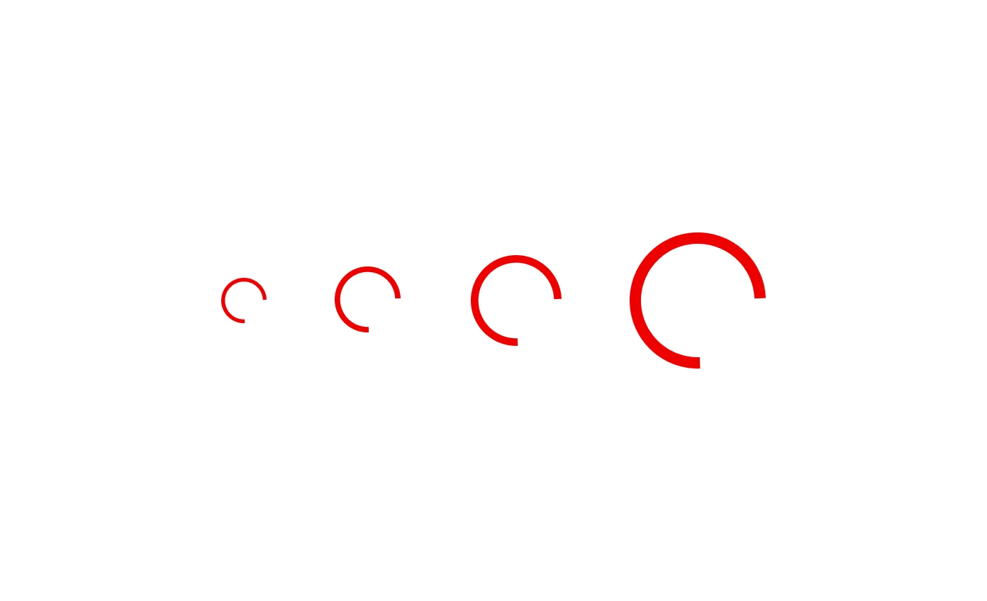
XS: 16 × 16 px · S: 24 × 24 px
M: 32 × 32 px · L: 48 × 48 px
Bars
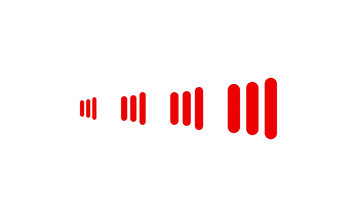
XS: 16 × 16 px · S: 24 × 24 px
M: 32 × 32 px · L: 48 × 48 px
Dots suits conversational or compact status feedback. Use the shared Button’s Loading state for button actions; its component owns the indicator.
Dots
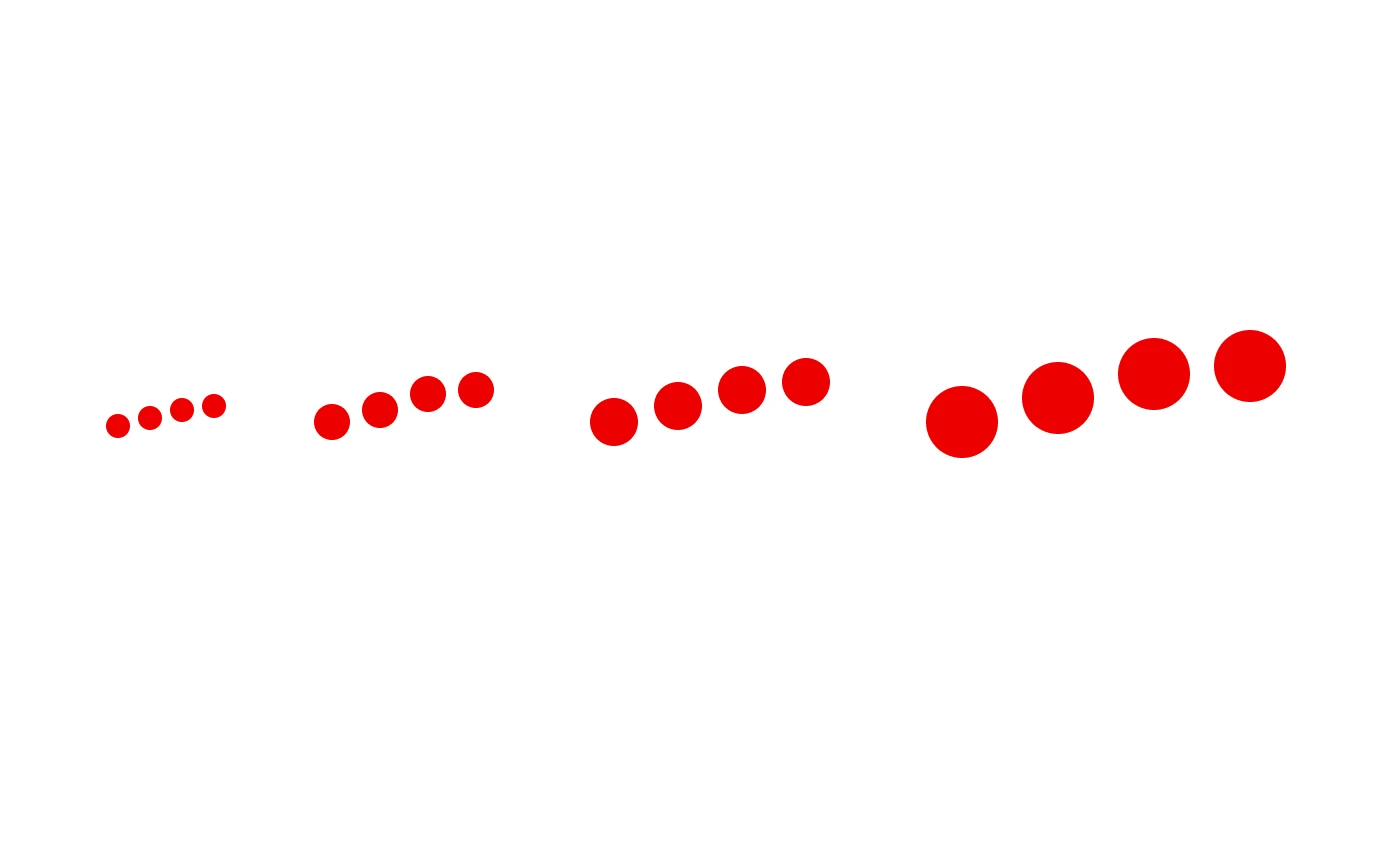
XS: 28 × 6 px · S: 45 × 9 px
M: 60 × 12 px · L: 90 × 18 px
Size | Description |
|---|---|
xsmall | Inline text, compact tables and labels |
Small | Compact regions and input feedback |
Medium | Cards, modals, content blocks |
Large | Large regions; avoid blocking usable content |
Brand Cube Loader
Component relationship
Brand Cube Loader is a separate component, not a variant of Loader. Use Loader for general loading feedback and Brand Cube Loader for branded loading moments connected to a product or business area. Both follow the shared loading and accessibility principles on this page.
Branded loading
Use Cube to bring Svenska Spel’s identity into loading moments connected to a game, product or business area. It creates a recognisable link between the Svenska Spel winner symbol and the product cubes, reinforcing both the shared brand and the character of the experience.

Make the sequence relevant to what is loading. Connect the Svenska Spel winner symbol with the relevant product cubes to create a cohesive branded moment.
Motion sequence
Connect the Svenska Spel winner with the relevant product cubes to create a cohesive branded loading experience.
Start with the Svenska Spel winner and rotate through the predefined product cubes. As each cube returns to face forward, switch to the next and gently slow down. Use smooth easing throughout.
After the last cube, return to the winner and loop while loading. Show ready content immediately; never wait for the loop to finish.
Business area
For loading at business-area level, connect the Svenska Spel winner symbol with a relevant selection of product cubes. This creates a shared Svenska Spel expression while making the business area recognisable.
Tur
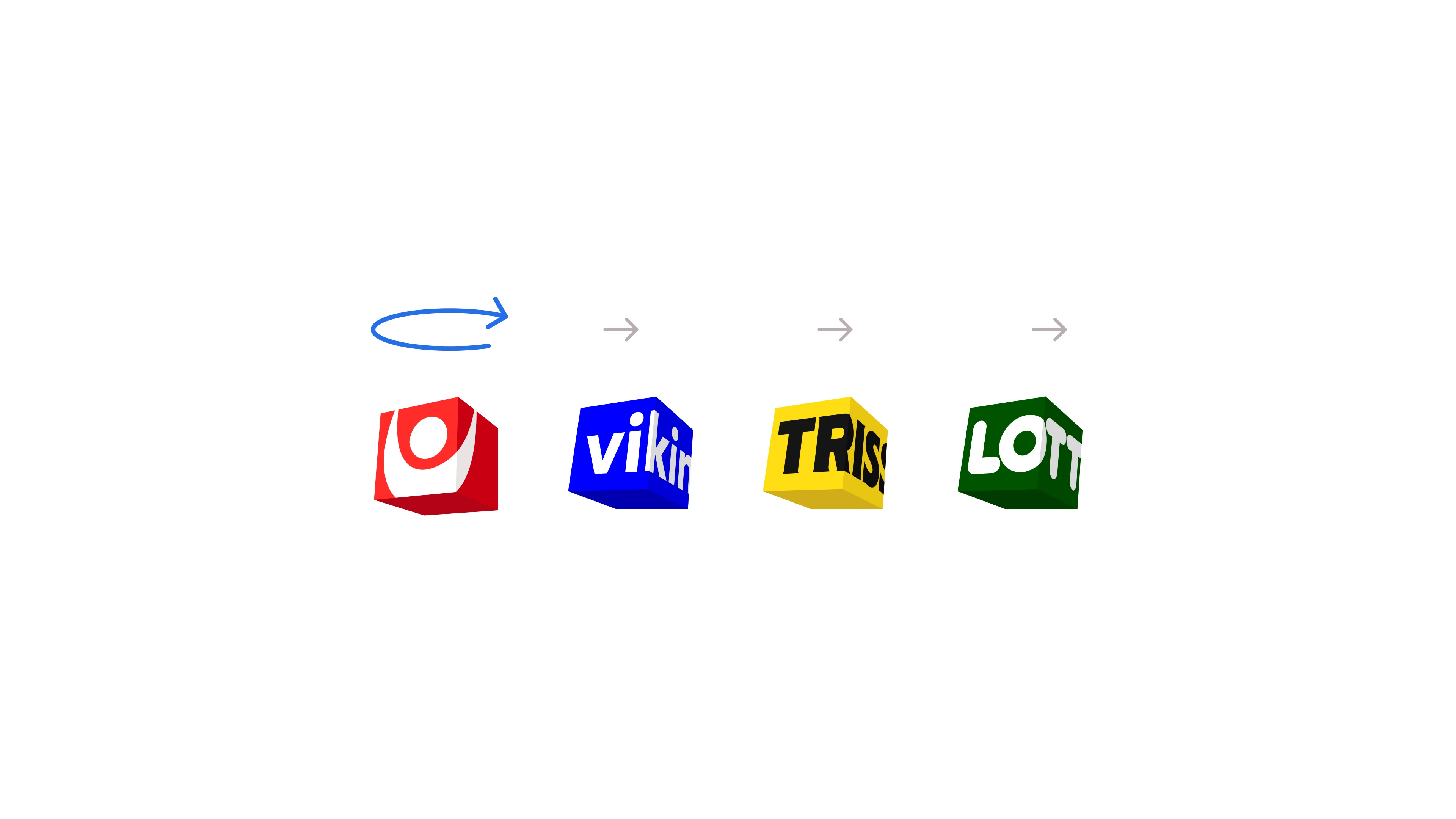
A shared loading expression for Tur and its products.
Sport / Casino
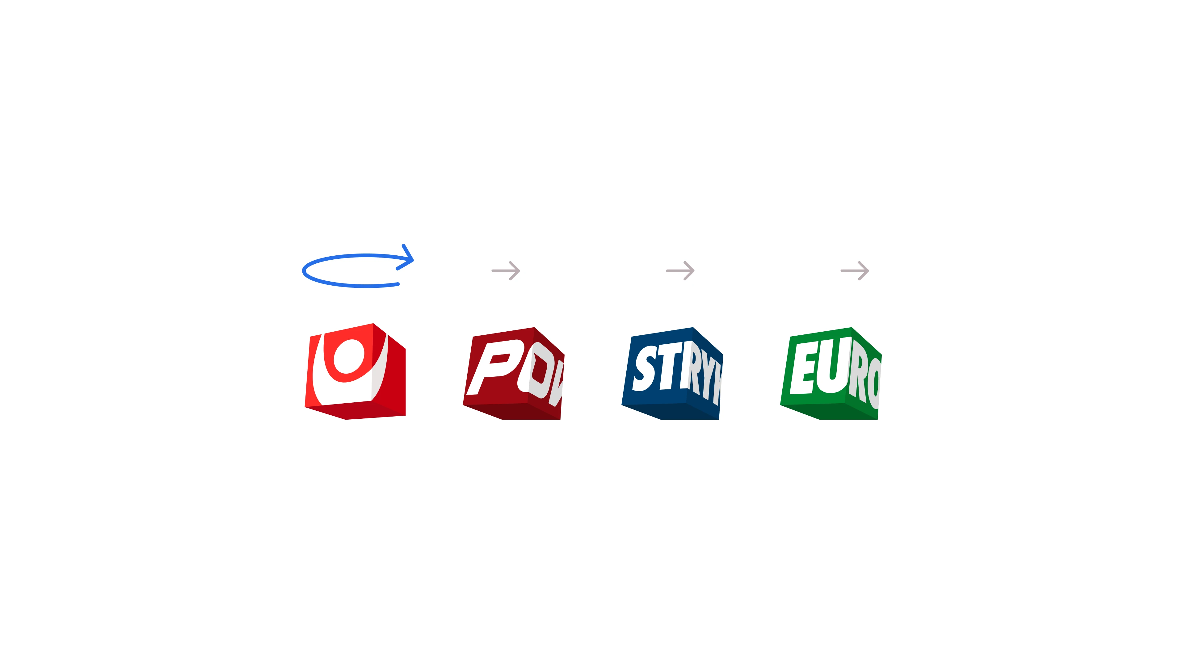
A shared loading expression for Sport / Casino and its products.
Products
When a specific game or product loads, pair the Svenska Spel winner symbol with that product’s cube. Use the waiting moment to strengthen product recognition and its connection to Svenska Spel.
Product example Powerplay
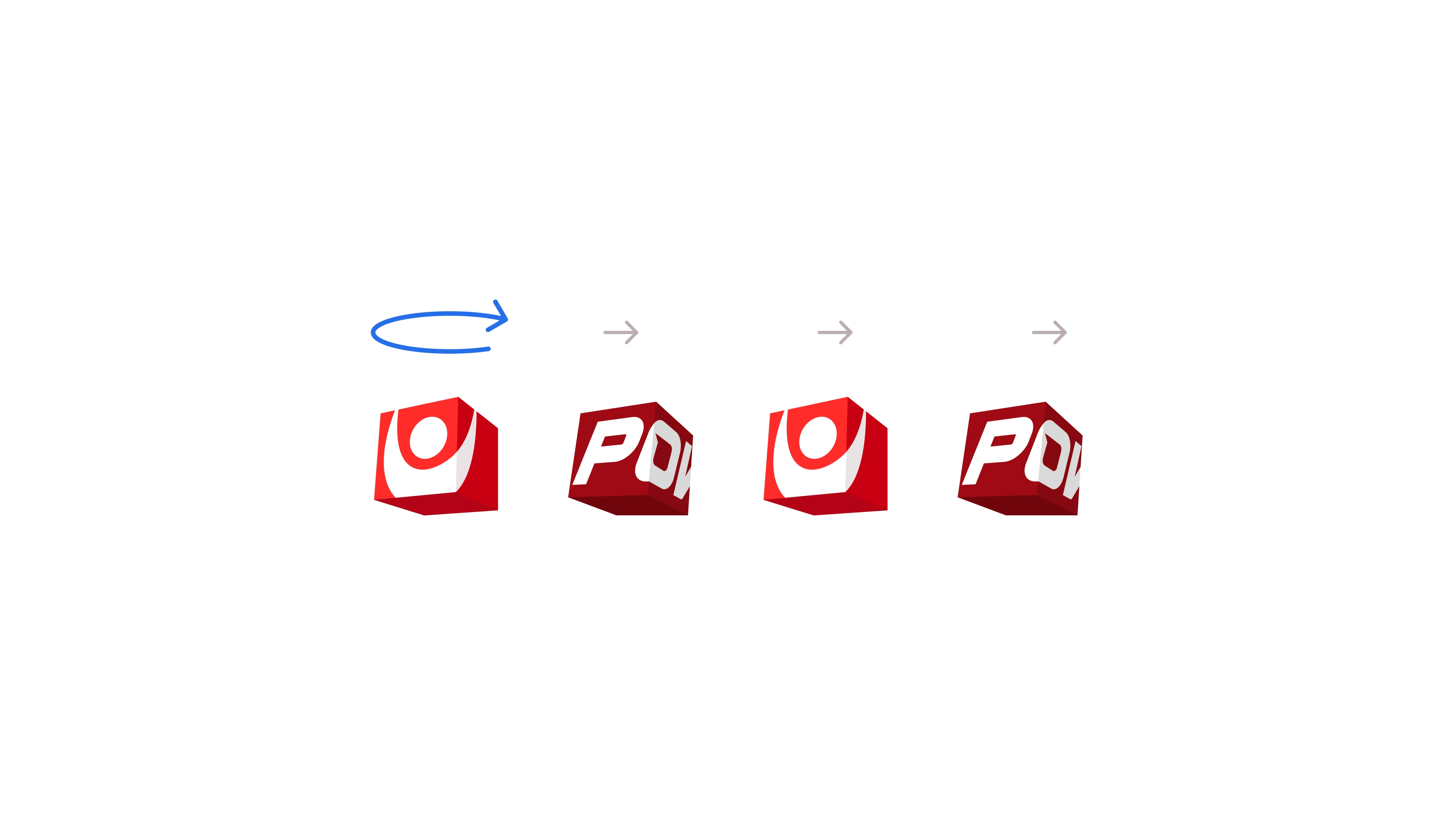
Connect the Svenska Spel winner symbol with the Powerplay cube.
Product example Lotto
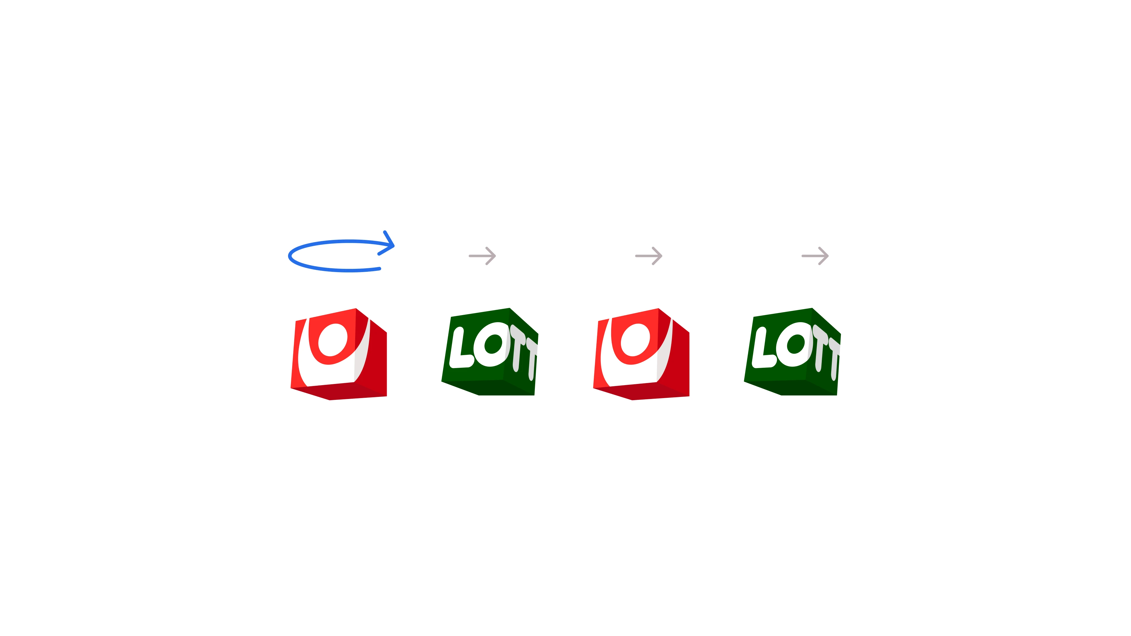
Connect the Svenska Spel winner symbol with the Lotto cube.
Anatomy and behaviour (Loader and Brand Cube Loader)
Anatomy
Loader and BrandCubeLoader include a built-in status region (role="status") and visually hidden text, defaulting to "Laddar". Use aria-label to customise the loading message for the task. Do not add a separate live region for the same loading message, as this may cause duplicate announcements.
Timing and outcomes
Acknowledge actions promptly. If work finishes immediately, show the result without an intermediate loader. Keep variant, size and layout stable during the request. For longer waits, explain the current step without invented percentages. End loading on success, failure, timeout or cancellation and show the outcome. Offer retry or cancellation where supported.
Placement and content
Placement
Place Loader within or beside the affected region. Centre standalone indicators within their region; align inline indicators with their status text. Preserve useful content during background refresh and reserve space to avoid layout shifts.
Responsive behaviour and content resilience
Keep the indicator at its published size and intrinsic proportions. Let status text wrap and its container grow. At narrow widths or with large text, stack the message below the indicator when needed. Test long Swedish text, zoom and Dots’ wider footprint. Never crop required feedback.
Status text
Use aria-label to customise the loading message for the task, e.g. “Hämtar resultat” or “Sparar ändringar”. For a longer wait, explain the known step. Report completion clearly and give a useful next step on failure. For payments or submitted bets with an unknown outcome, confirm the transaction status before inviting another submission.
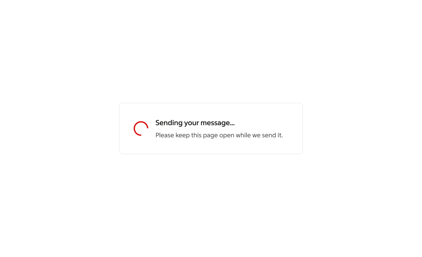
Example: Button with its built-in Loading state

Use the Button’s Loading state, not a separate Loader beside it. Keep the control and focus context stable, prevent repeat submission, and announce the outcome. The Button component owns its indicator and dimensions.
Accessibility (Loader and Brand Cube Loader)
Screen readers and ARIA
Use the built-in role="status" and customise its message with aria-label. Do not add another live region for the same loading message. Keep decorative animation hidden from assistive technology, not the status region. Preserve focus; do not make the indicator focusable. If using aria-busy, keep the announcing status outside the busy subtree. Announce completion or failure separately.
Reduced motion
When prefers-reduced-motion is enabled, replace nonessential animation with a static indicator and status text, or text alone. Keep completion and failure feedback available. Verify the shared implementation’s support; do not assume it is built in.
One loading announcement
Loader and BrandCubeLoader already include a built-in status region (role="status") and visually hidden text, defaulting to “Laddar”.
Customise the loading message using aria-label, e.g. “Hämtar resultat” or “Sparar ändringar”. Visible task text can still be helpful, especially for a longer wait, but announce the same message once. Verify with a screen reader that the customised message does not also announce the default “Laddar”.
Visible task context
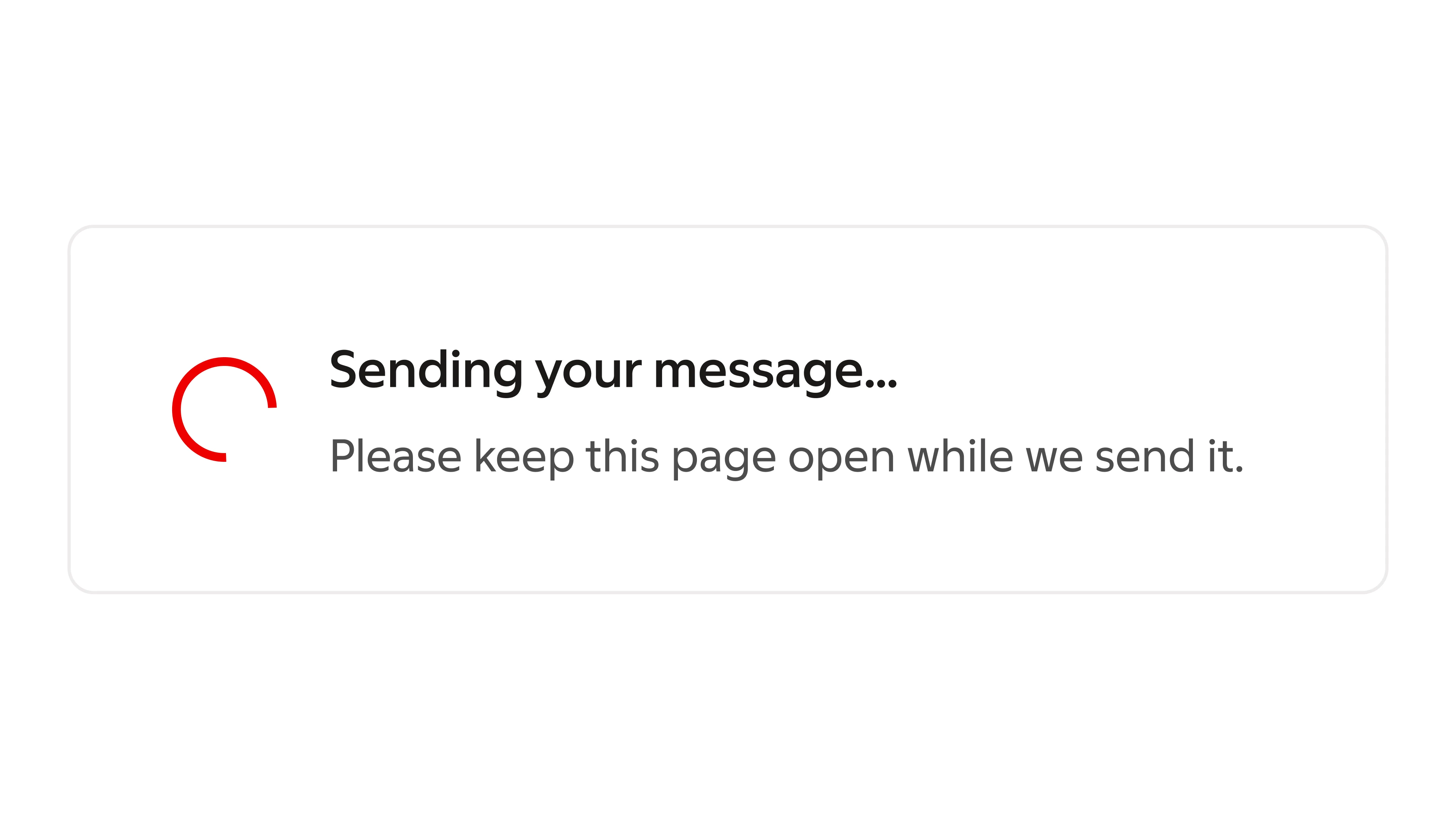
Unclear longer wait