Components
Date Picker

Date pickers make it easy for users to choose specific dates or date ranges by providing a calendar view with an overview of days, months, and years.
Interactive demo
This demo lets you preview the Date picker component, its variations, and configuration options. Use toggle single and grouped configuration.
<No Display Name onSet={function noRefCheck() {}} />
Usage
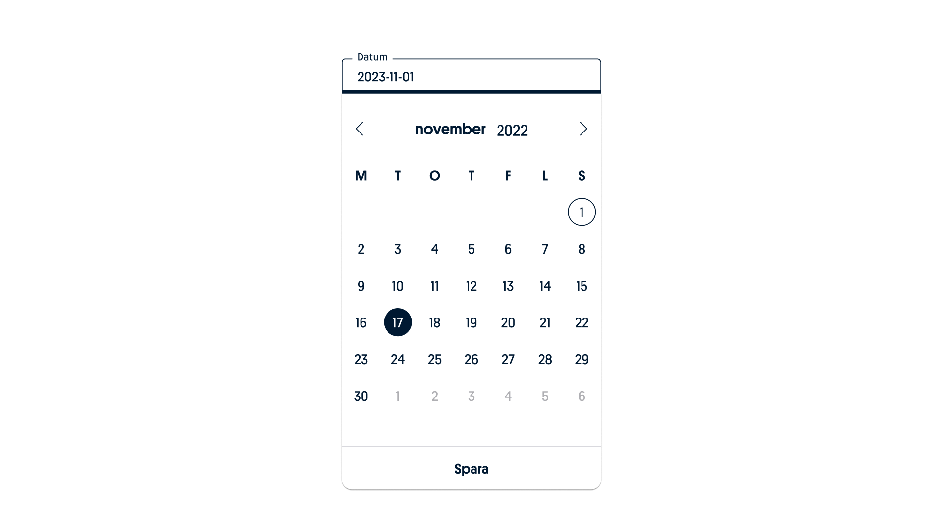
Docked date pickers enable users to select specific dates, years, and times. The default view includes a date input field, and with interaction, a dropdown calendar becomes accessible. This dual input method offers versatility for date and time selection, making it suitable for a wide range of temporal needs, from immediate dates to distant ones.
Behaviour
Dates can be added by simply clicking on the desired date. Give it a try using the interactive demo.

Date selection
To select a date, click on your first desired date.
Date range
To select a date range, click on your first desired date, and then click on the last date.

Month selection
You can navigate through month selections by simply tapping or clicking on your desired month.

Year selection
The frame's title is displayed in both the collapsed and expanded states. The title text can span multiple lines if necessary. The same applies to selecting a year by simply clicking on your desired choice.

Time selection
Time selection is integrated using a native approach to guarantee a user-friendly experience consistent with the user's device and browser.

Native time selections
We've integrated native solutions into our timepicker to guarantee that it meets users' expectations across different platforms and browsers, resulting in a user-friendly experience.
Examples of native time pickers.

iOS native time picker.

Android native time picker.
Formatting
Anatomy datepicker

A. Input field
B. Title, month and year selection
C. Icon button
D. Weekdays label text
E. Today’s date
F. Unselected date
G. Selected date
H. Container
I. Text button
Anatomy weekday

A. Title (Weekday)
B. Weekday (Number)
Anatomy month

A. Icon button
B. Month selection
C. Selected month
D. Text button
Anatomy date range

A. Input field (showing selected dates in text)
B. Selected start date
C. Active dates in range
D. Selected end of date range
Variants
Single date picker
To select a date, click on your first desired date.
Date and time picker – with start times
Click on your preferred date, then click on the clock icon button to access native time selection.
Date and time picker – with end times

Click on your preferred date, then click on the clock icon button to access native time selection.
Date and time picker – with start & end times

Click on your desired date and click on the clock icon button for both start and end time to access native time selection.
Range date picker
To select a date range, click on your first desired date, and then click on the last date.
Range date and time picker

This variant have three choices – only a start time, only an end time, or both start and end times as choices.
Date picker with weekdays

This option is available in the day and day range variants, to give the user more information.
Sizes
The Date picker comes in two sizes. Default for desktop and mobile views and small size for smaller mobile views (320px)

Size comparison: default size vs small.
Branding

Sport & Casino and Tur Date picker.
Responsive layout
The Date picker is in a fixed size. Use either’ Default’ in both desktop and mobile and ‘Small’ when in smaller mobile views.
