Components
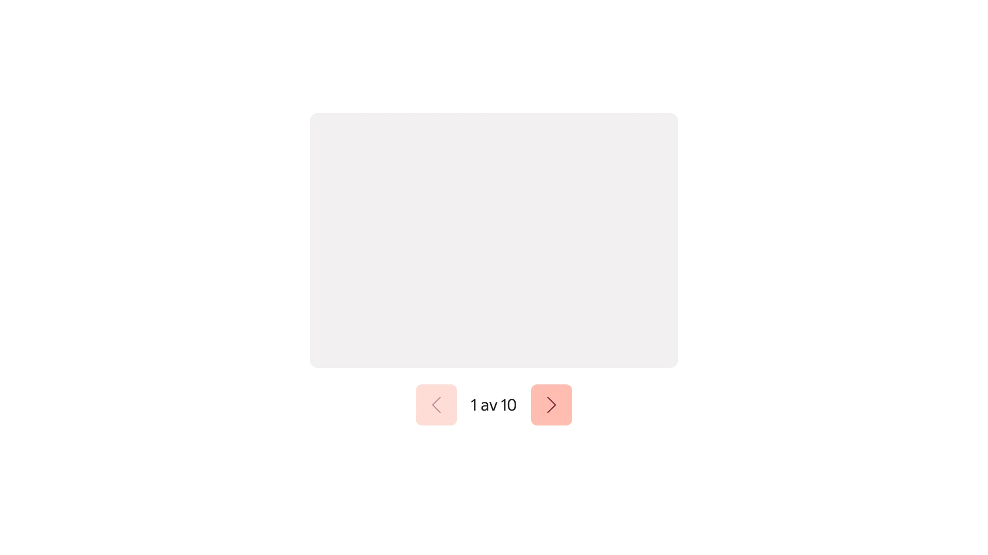
CarouselCarousel allows the user to navigate back and forwards horizontally through a set of thematically similar items.
Usage
Use a Carousel to let users browse a sequence of related images or other content within a shared space. It works best when users can explore items individually without needing to compare them side by side. Keep each slide focused and use a consistent layout.
Content
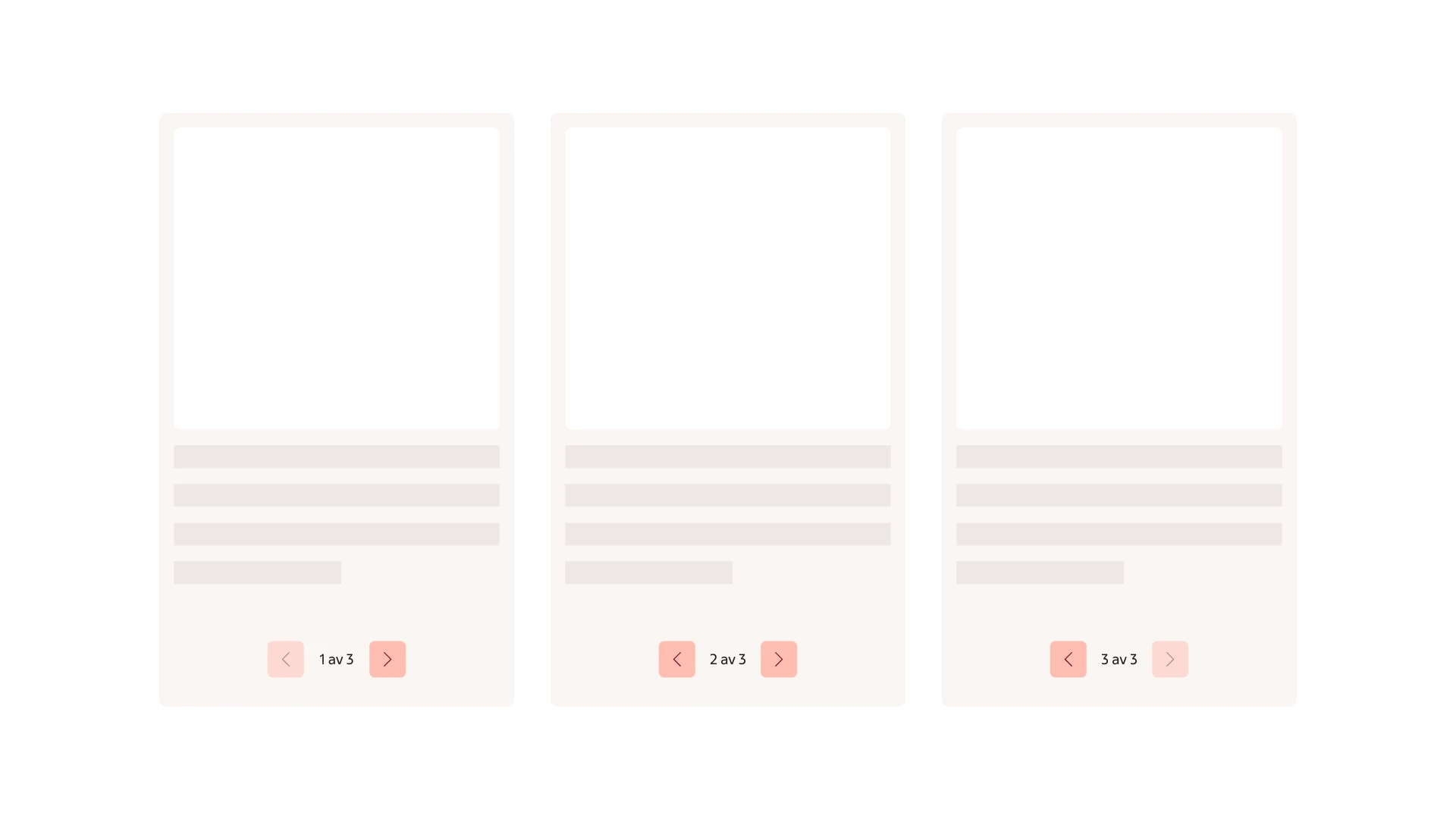
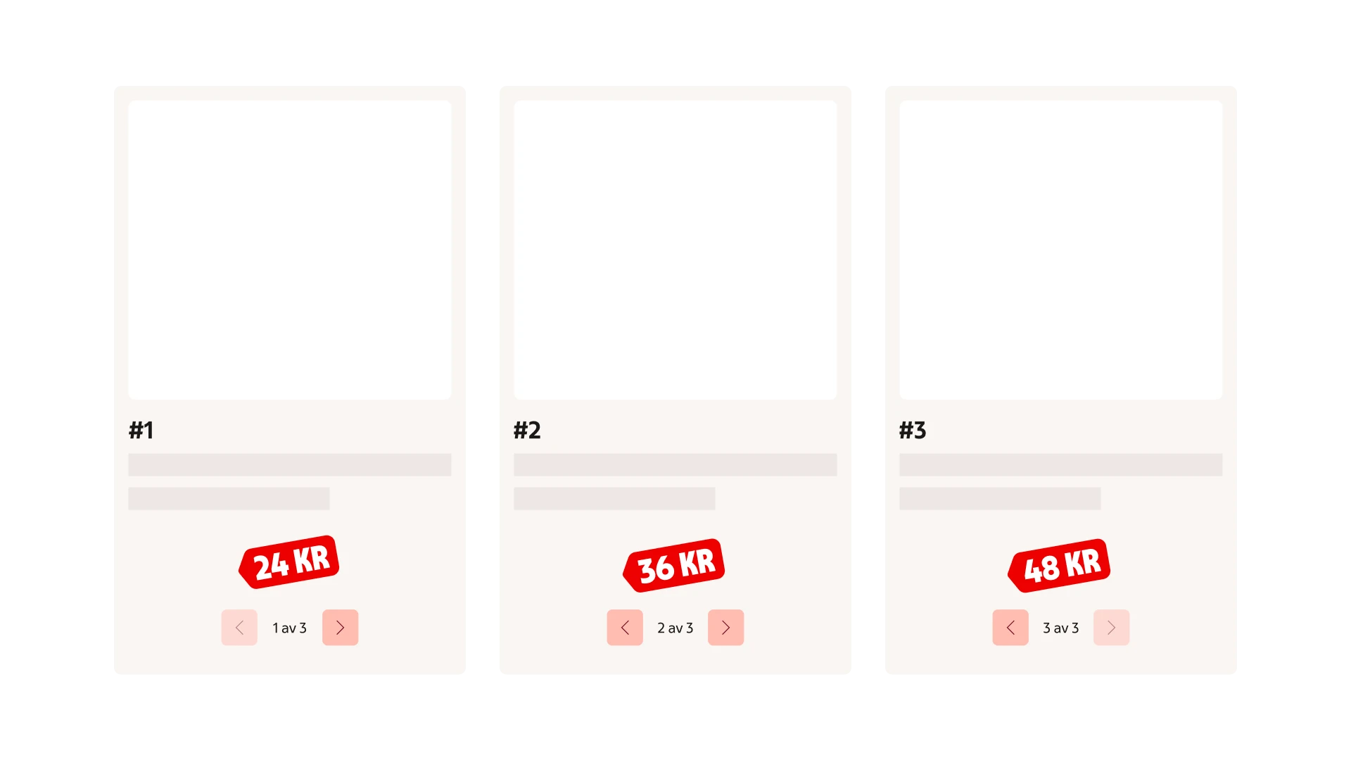
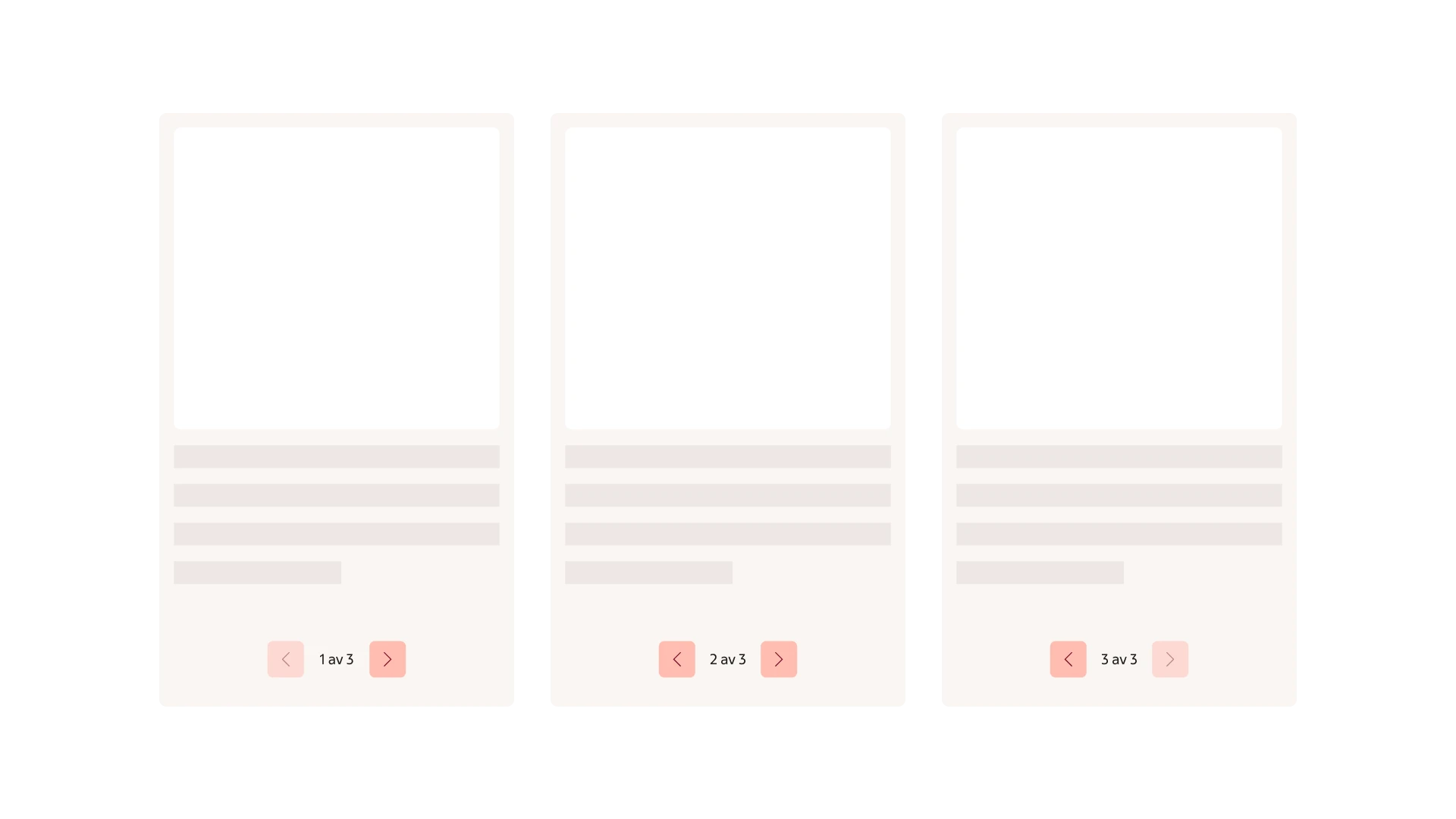
Carousels are suitable for presenting images and texts that users can explore one at a time. Each slide should be concise, self-contained and consistent in structure. Avoid content that relies on reading slides in order, or information that users need to compare side by side. Essential information should be kept outside of the Carousel.
The recommended amount of slides within a carousel is three to five. More or fewer can be appropriate, but consider if another interaction pattern may be more suitable.
Suitable use cases
Consistent content
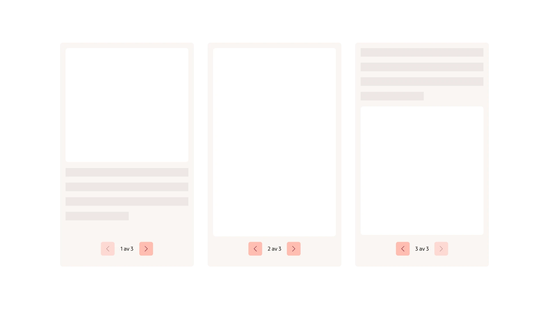
Formatting
Anatomy
Carousel is made up of an area for adding content along with an instance of the pagination providing controls for navigating back and forward.
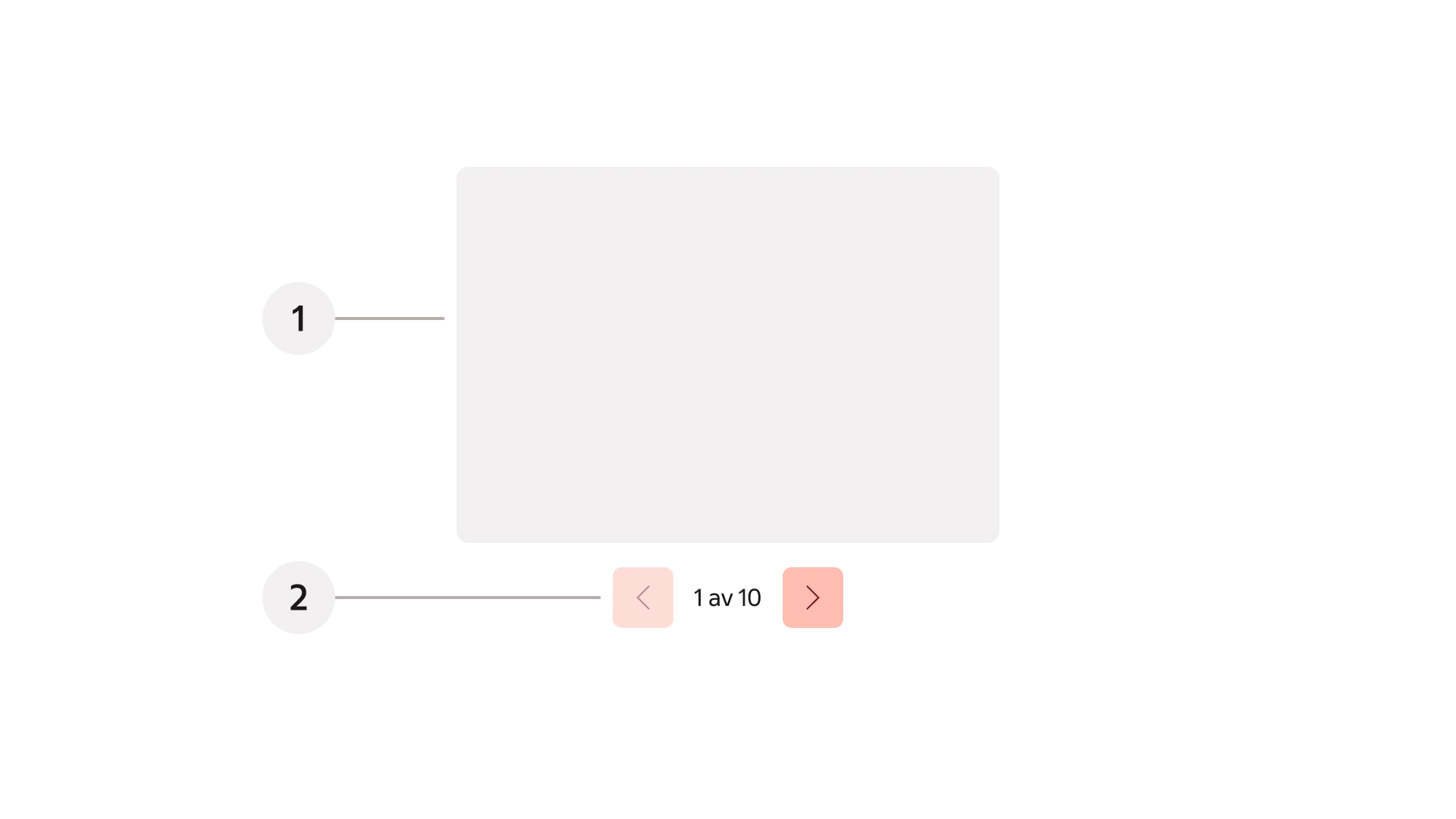
- Content area
- Pagination
Behaviour
Navigation
Previous and next controls are provided through the pagination component. Let the user manually control navigation, automatic advancement is not supported. A counter with current position along with total number of slides is displayed. Relevant controls are displayed at the start and the end of the sequence. Typically navigation should not loop last frame back to first, and vice versa.
Left and right arrow keys navigate horizontally with a keyboard. In touch devices swiping is supported to navigate.
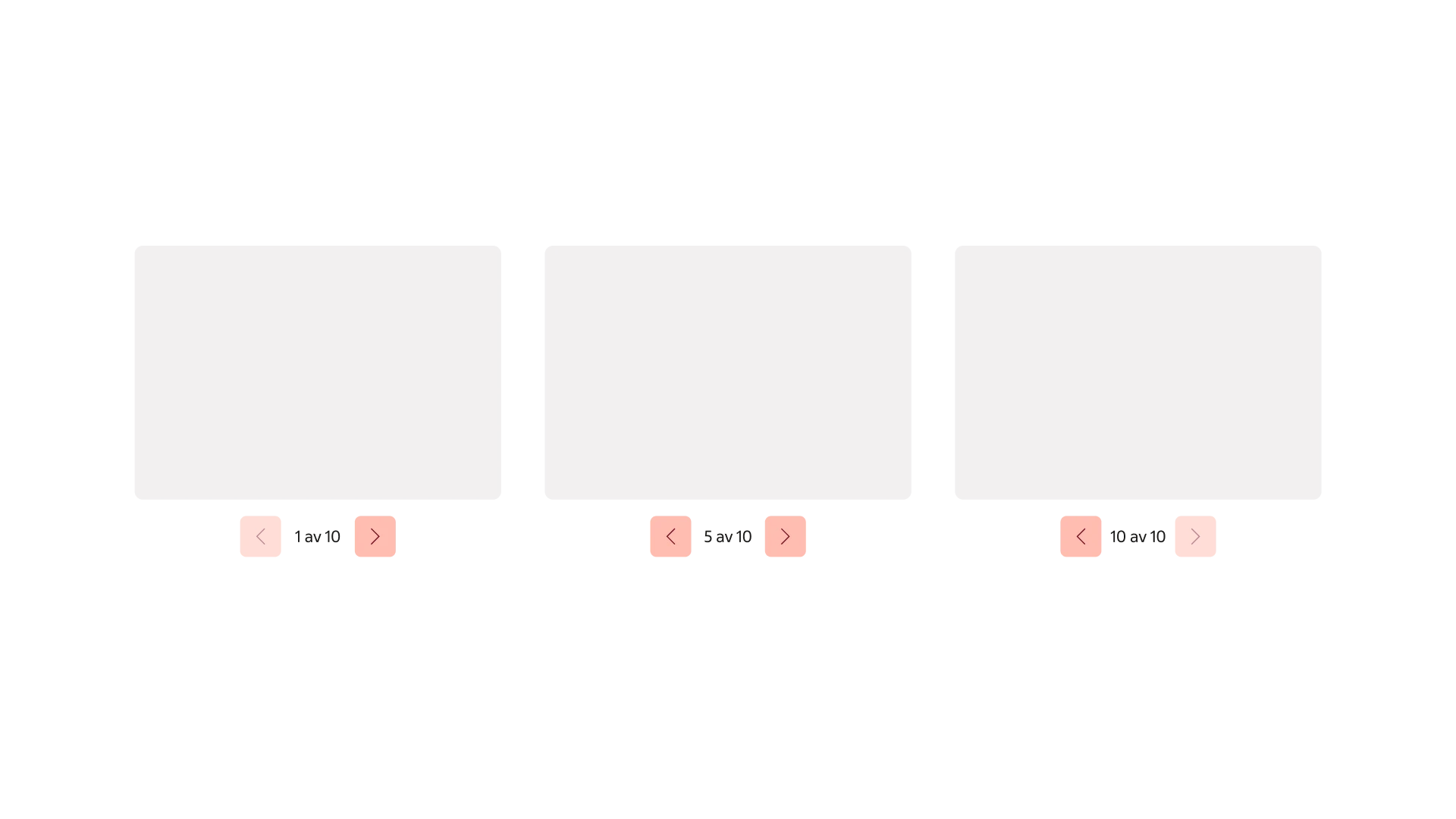
Pagination used for navigating the content of the Carousel.