Components
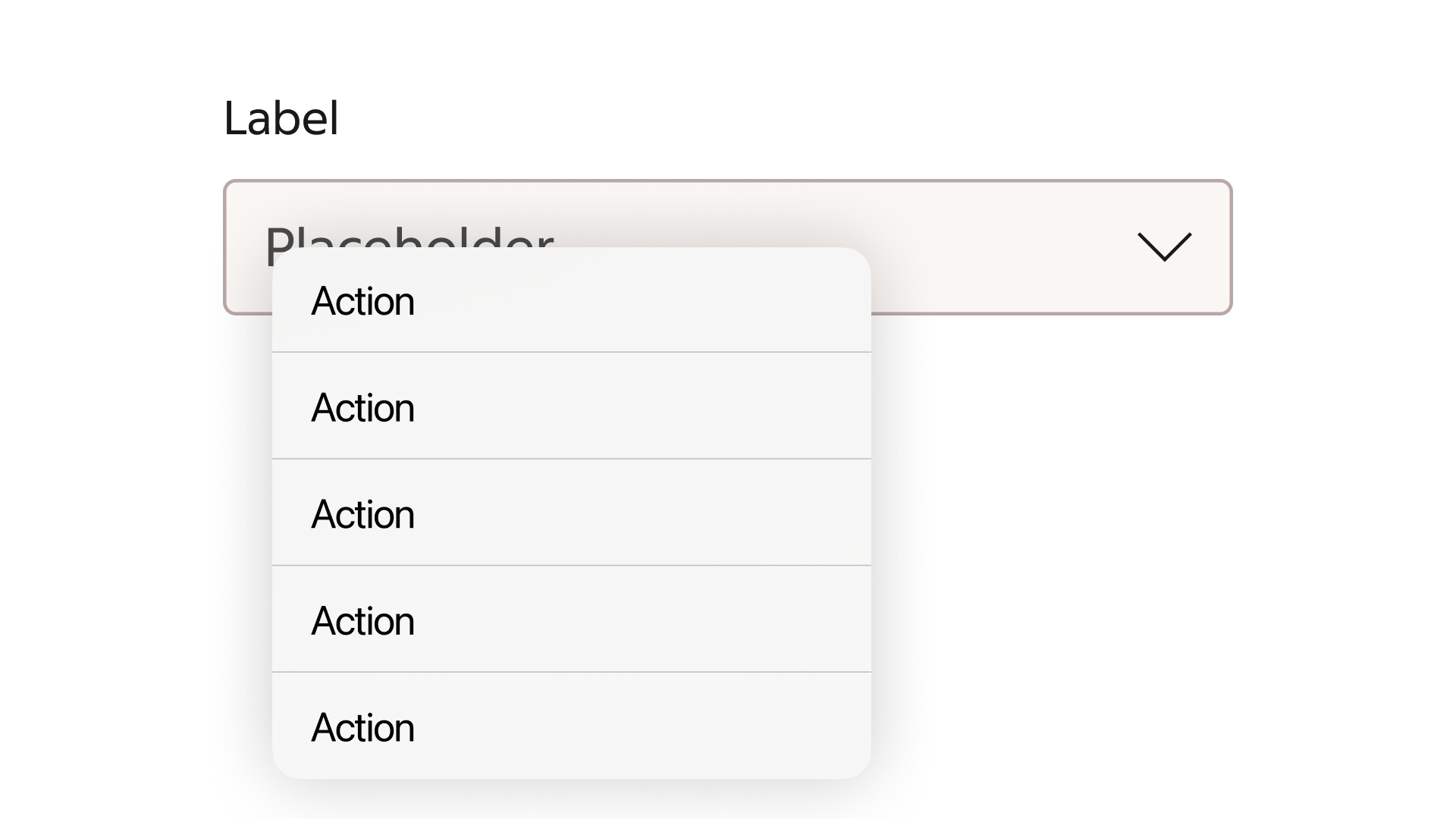
Native SelectNative Select lets users choose from a list of text options using their device’s native selection menu.
Usage
Use Native Select for standard selections where text options are sufficient and the device’s familiar selection interaction fits the task. For a short list of options that should remain visible, consider a Radio Group.
Native Select or Select?
Native Select
Native Select uses the browser’s native HTML select element. The device and browser control the open menu’s appearance and interaction.
Select
Select uses a custom menu. Choose it when options need icons or a customized presentation.
The field follows Nova’s styling, but the open native menu can look different on desktop, iOS and Android. Treat the illustration as an example of one device’s menu.
Guidelines
- Give the field a short, clear label describing the expected selection.
- Keep option text concise and order options predictably, such as months in calendar order.
- When no option is preselected, provide an initial option that prompts the user to choose.
- Provide help text when the choice needs explanation and a clear error message when validation fails.
- Keep the label and any help or error text associated with the field. Verify keyboard interaction on the devices and browsers your product supports.
See Code for the published Nova examples and NativeSelect API documentation.